Showing posts with label Letterform. Show all posts

Monday, May 27, 2019

1894 First Greek American Type Face


Newspapers offer an invaluable source of information for Greek American history. Atlantis (founded 1894) and the National Herald (founded 1915) were the two competing Greek language newspaper, which represented a double political dichotomy; Atlantis was Greek monarchist and US Republican, while the National Herald was  Greek Venizelist and US Democrat.

Atlantis, whose publication ended in 1972, is less known than the National Herald that continues to be in print, online, and recently digitized. The National Herald is a familiar image with its vivid Archaizing title read by grandparents and parents in the Greek American home. WPA photographer Jack Delano captured the newspaper's type face, as read by a steel worker in western Pennsylvania in 1941.


Originating in the 1930s, this Archaizing style of letters brings nationalistic associations of ancient grandeur. Although originating before its monopolization by the Metaxas dictatorship (1936-40), this font retains some unfortunate associations of militarism (and used today by the Golden Dawn Neo Nazi party). English language type face of the 1920s became equally historicist and classicizing. American print entered a golden age of Times New Roman and combatted the Victorian chaos of styles and lack of standardization.

Twenty years older than the National Herald, the type face of Atlantis is a product of the 19th century, where newspapers print occupied the same visual surface with wall advertising and posters. In addition to a strong serif, the letters have shadows that help them pop from the surface of the paper and grab your attention three-dimensionally. Like the fictive continent of Atlantis, the letter forms make one think of the extraordinary voyages of Jules Verne. Above, you see the title of the first issue of the paper, March 3, 1894. It might be the earliest example of Greek American letter press. As noted in earlier posts, a complete run of Atlantis survives in the Historical Society of Pennsylvania, where I have photographed it above. 

Monday, April 23, 2012

Dream Lancaster

143 N. Water St., Lancaster, Pa.

Thursday, December 09, 2010

Kephallenos ABCs

Yannis Kephallenos illustrated a children's alphabet book in 1932 that was on display at the MIETS exhibition in Athens and Thessaloniki. The exhibit also featured a mock-up below.
I'm not sure whether graphic design has been critically studied for Greece beyond a few monographs. The culture of letters is fairly intense in Greece, with people caring deeply about letterforms and the history or printing the Greek word. After all, it's countries where linguistics is deeply entangled with politics that you find a sophisticated literary culture among the general population. But graphic design is a little bit different; it requires visual literacy. And I've always felt that Greece has been in the literary avant-garde (Cavafy, Seferis, Elytis) but in the visual backwaters. The situation is exactly the opposite in Spain and Italy, where the visual avant-garde overshadowed the literary avant-garde. Whatever the case may be, Greece's visual modernism is for the most part derivative. That does not mean that Greece's modernism is any less interesting. Since the 1990s, art historians have convincingly elevated the provincial avant-gardes (not French, German, Soviet or Dutch) into the canon. Czech and (to a lesser extent Balkan) avant-gardes make a good case.

Yannis Kephallenos is definitely a landmark in the history of Greek graphic design both as a producer and as a teacher. I'm not certain that he can stand up to the masters of letterforms from Europe and the U.S., from whom he learned. Kephallenos' letterforms for the textbook by Delipetros, Doukas and Imvrioti illustrates an streamlined elegance married with the concerns of "Ellinikotita" evident in the archaizing fonts of the 1930s. At a superficial level, Greek archaizing fonts carry connotations of dictatorships. Cultural trends and artistic strategies developed by the Metaxas regime (1936-40) were picked up again by the junta (1968-74). Italian modernism bears a similar burden to the extent that the 1930s are inseparable from Mussolini. Whereas private enterprise and the marketing of desire were motivating factors in the development of graphic sophistication in the U.S., the venues of graphic expression available in Greece had a limited marketing potential. Directly or indirectly, the state was central as was the concern over the state's fate.

Nevertheless, Kephallenos' design is vital. His diagonal letters CHILDREN overlap in the same way that his BESIEGED SLAVES did back five years earlier. I thank John Stathatos for also seeing an unresolved crampedness in the latter. CHILDREN is better resolved, although difficult to read. The tension between the geometrical and the figurative show the influence of Bauhaus sensibilities on the one hand and social realism on the other. Like the case with American graphic design of the 1930s, Greek tastes are caught in a battle between rarefied elitist modernism and popular social realism. The "grotesque" result (as it has been referred to by American cultural historians) is more interesting than its pure manifestations.

Tuesday, December 07, 2010

1930s v 1920s

So, what is the difference between the 1930s and the 1920s? I asked my Orange Notebook.

1936 datestone, Keiper Liberal Arts Building, Franklin & Marshall College, William Lee
1922 datestone, Franklin Field, University of Pennsylvania, Charles Klauder

But Amelia Rauser gave a better answer in just two words "Letty Lynton"
and Jennifer Redmann gave the answer (via Facebook) in the form of two films:

"For me (German lit/culture person), the difference between the 20s and 30s is embodied in 2 films: "Das Kabinett des Dr. Caligari" (1920) and "M - Die Stadt sucht einen Mörder" (1931). In Caligari we find a topsy-turvy world in which reality and fantasy are indistinguishable, but by M, that has given way to sober hyperrealism - our world is being poisoned destroyed by sick, insane forces, and the "state" needs to take action to put a stop to it."

Monday, December 06, 2010

1930s Jazz Fonts

Thinking about 1930s fonts, I made some references to the effects of neon lights in the exaggeration of letter elements (the thick-and-thin). I hope that the image below will clarify this added three-dimensional factor that neon lights introduced. Although the particular font comes from a recent restoration, the building is a movie theater at Bryn Mawr, Pennsylvania. I was out there last Friday to organize a traveling venue for the Peschke show (the meeting went well beyond my greatest expectation). I will have more to say about this building -- since it was designed by the architect who shaped Franklin & Marshall's 1930s identity (William Lee is to F&M's 1930s what Charles Klauder is to F&M's 1920s).
So, neon lights came to the U.S. in the 1920s and took over the night-time urban landscape in the 1930s. Since it is "Franklin" that got me started on period fonts, let me turn to another Franklin case study, not Franklin Field, or Franklin & Marshall College, but Franklin the jazz nightclub in New York. I saw the Franklin's marquee while previewing Ken Burns' Jazz (2001) documentary, Episode 4: The True Welcome (1:12:29 min). What I tried to show with the sketch below is the placement of the letters against the neon tubes (shown in red).
Period photos of nightclubs like the Savoy, show the use of jazzy fonts to advertise performances. Look at the font below used at the Brooklyn Paramount to advertise "DUKE ELLINGTON and His Cotton Club Orchestra IN PERSON," also from Ken Burn's Jazz (Episode 4, 1:17:23 min).
I wouldn't want to argue that swing directly influenced typography. The swing nightlife, however, had a profound graphic effect in advertising shows and grabbing the passer's-by attention.

Sunday, December 05, 2010

Astaire Shoes

In addition to the projected triple shadows, Fred Astaire's Bojangles dance in Swing Time (1935) has psychoanalytical potential from the point of view of shoes. I feel that this must be mentioned, in order to clarify Kevin Brady's recommended readings from Zizek, quoted below. The dance routine begins with a gigantic personification of Bojangles through the bottom of Astaire's shows. Above, we see the stage sets for the soles, the bow-tie, the collar, the hat, and the racially exaggerated lips. In the background, a model of Harlem can also be seen. As the dance progresses, Astaire spreads his gigantic legs to reveal his striped pants that lead to his crotch. The dancers spread his legs open, and the viewer realizes that they are superhuman props.

I've followed up some of the racial tensions of Astaire's Bojangles to encounter a critical impasse. Some critics find Astaire's blackface intolerable, while others see in this performance an honest commemoration. Astaire's "Bojangles of Harlem" is here paying direct tribute to a historical figure, Bill "Bojangles" Robinson (1878-1949), one of the most popular African-American dance performers. At one level, therefore, we must acknowledge that Astaire is paying direct tribute rather than stereotyping. He acknowledges Bill Robinson's contributions to dance innovations. Hence, in the racially offensive scale, Astaire is somewhere in the grayer zone.

Going back to shoes, I quote the Zizek passages that Kevin Brady sent me, along with a most recent conversation:

Hi Kostis,
I re-read your new blog post about Astaire and Bojangles. Something that strikes me about the illustrations you provide (- besides the odd (bizarre? anamorphic?) - in any event, a floor-up perspective in which all lines converge on crotch (genitals and anus): from that viewpoint, we're as far as possible from the humanizing (& subjectivizing) features of the face, and the heads-up, feet-down "architecture" of the human figure is subverted (recalling here surrealist photography of toes and upside-down faces - Man Ray 1920s?). The identification of the movie screen itself with the dance floor - the mediating surface between the audience and film worlds - is interesting - horizontal is vertical, as if to say, this is one kooky, topsy-turvy world!
Kevin Brady, December 6, 2010 10:06 AM

ZIZEK PASSAGES

"Andersen's fairy tale The Red Shoes, an impoverished young woman puts on a pair of magical shoes and almost dies when her feet won't stop dancing. She is only saved when an executioner cuts off her feet with his axe. Her still-shod feet dance on, whereas she is given wooden feet and finds peace in religion. These shoes stand for drive at its purest: an 'undead' partial object that functions as a kind of impersonal willing: 'it wants', it persists in its repetitive movement (of dancing), it follows its path and exacts its satisfaction at any price, irrespective of the subject's well-being. This drive is that which is 'in the subject more than herself': although the subject cannot ever 'subjectivize' it, assume it as 'her own' by way of saying 'It is I who want to do this!' it nonetheless operates in her very kernel." From “Love Beyond Law” by Slavoj Zizek, a paper was first published in the Journal for the Psychoanalysis of Culture and Society 1 (1996), 160-61, as a review of Bruce Fink's The Lacanian Subject: Between Language and Jouissance (Princeton: Princeton University Press, 1995).


"The fascinating thing about partial objects, in the sense of organs without bodies, is that they embody what Freud called “death drive”. Here, we have to be very careful. Death drive is not kind of a Buddhist striving for annihilation. I want to find eternal peace. I want… No. Death drive is almost the opposite. Death drive is the dimension of what in the Stephen King-like horror fiction is called the dimension of the undead, of living dead, of something which remains alive even after it is dead. And it’s, in a way, immortal in its deadness itself. It goes on, insists. You can not destroy it. The more you cut it, the more it insists, it goes on. This dimension, of a kind of diabolical undeadness, is what partial objects are about. The nicest example here for me, I think, is Michael Powell’s Red Shoes, about a ballerina. Her passion for dancing is materialised in her shoes taking over. The shoes are literally the undead object." From Slavoj Zizek, The Pervert’s Guide to the Cinema.

Saturday, December 04, 2010

Astaire and Zizek

Friend and F&M colleague Kevin Brady sent a great response to my earlier posting on Astaire's Swing Time, suggesting psychoanalytical trajectories and Zizek readings:

Dear Kostis
You might find this interesting - on a note tangentially related to your blog post about Fred Astaire, projected shadows, fonts and Robert Longo (all fascinating, by the way) - Your description of Fred Astaire standing aside to watch his own triple projection dance dovetails nicely with Slavoj Zizek's various film illustrations of Freudian-Lacanian desire vs. drive, and "death drive" in action (see two texts from Zizek, attached) - and in that regard, your use of the word "subject" in the blog is spot-on (desire is subjectivized, drive isn't).
The "projected" self, in Lacanian lingo, is the subject "barred" upon entering the socio-symbolic order (i.e. culture and language). The fact that Fred Astaire stands aside to watch three magnified selves dance autonomously can be related (I would think, speaking as a psychoanalytic amateur) to several other film motifs - e.g., Mickey Mouse in The Sorcerer's Apprentice (1940), where the broom is a nightmare evocation of the Lacanian "partial object" (autonomous body part); the young woman in The Red Shoes (1948), who in the original story has to cut her feet off, because they won't stop dancing; Peter Sellers' "Heil Hitler" arm/hand in Dr. Strangelove (1964); even Forrest Gump's crazy running legs (1994, he can't stop himself, and his running always follows upon some loss or tragedy - in a word, drive takes over from desire). Zizek would add Fight Club (1999), where the main character can't stop his own autonomous fist from beating him up.
I haven't read much about Robert Longo, only seen images; but the psychoanalytic patterns suggested here (drive vs. desire, partial objects, symbolic castration or dismemberment in the socio-symbolic order) would probably readily apply - people flattened almost violently in their 1980s corporate costumes. It's significant that the three Longo figures are facelesss, de-subjectivized - possibly more traumatized than "dancing"? Has anyone related these images to crime scene photography?
Thanks for the thought-provoking blog piece!
Kevin Brady, December 4, 2010 9:42 AM

Thursday, December 02, 2010

Bojangles in Harlem 1936

I thank Johanna for commenting on the Top Hat font and sending me to Fred Astaire's Bojangles in Harlem in Swing Time (RKO Pictures, 1936). The scene is aesthetically rich, if the viewer manages to pass over the highly offensive blackface. At the end of the scene, Astaire dances behind a triple projection of his own silhouette (sketched left). I send readers to my earlier thoughts on 1930s silhouettes here, elicited by the portraits that Georg von Peschke drew while excavating in Corinth. Incidentally, I got a chance to see all 20 of the Peshcke silhouettes in Athens this summer, but I must leave them for a future posting. Astaire's silhouettes elucidate the popular 1930s font, which pitch a thick line against a thin line in each letter. High contrast, thick-and-thin, large-and-small are in some ways the product of illuminated projection and the electricity of film and signage. I will show in a future posting that neon lights contributed to the development of fonts in the 1930s. Neon lighting has a three dimensional quality. The solid letter in the background is illuminated by a neon tube in the foreground that replicates the letter in form a few inches in front of the letter. The neon light does not occupy the same plane as the letter which it illuminates because physical contact would burn the letter from the tube's heat. A physical gap between neon and letter backdrop introduces perspectival variation as the viewer moves around the sign. Perspectival variation is what distinguishes Astaire's three shadows, since they are generated by three lights positioned around a circular platform to the right, center, and left of the real Astaire.

Like the black shadow of Fred Astaire, typography and neon tubes engaged the viewer in a game of projection. The high-contrast of shadows cultivated a minimalist aesthetic on a fertile black-and-white screen. But the dialectic of dancer vs. shadows supersedes simple mechanical replication the moment that Astaire's shadows disengage from Astaire and take on a life of their own. Astaire stops and observes his triple body move without his volition behind him. He stops being the generator of motion, or the object of projection, and he turns into a subject. He watches himself, as we watch him. His triples become his dance partners.

Astaire's black silhouettes are also interesting in light of Robert Longo's 1979 "Men in the Cities" series. Longo's involvement with the post-punk New York scene makes "Men in the Cities" the most iconic artistic expression of 1980s New Wave. It was one of the first images in Sympathy for the Devil: Art and Rock and Roll since 1967, a groundbreaking exhibit at the Museum of Contemporary Art in Chicago in 2008. Fortunately for me, the Archaeological Institute of America's annual meetings in 2008 were in Chicago and I got a chance to see the show; see catalog, here. As with the staging of Astaire's dance, Longo's dancers were displayed as a triptych (see photo of Dominic Molon, curator, in front of Longo's series here).

Whether intentional or not, I love the visual affinity solicited by Astaire's iconic dance. After all, punk archaeology begins in the 1930s, as Lewis Erenberg has convinced me in "The Crowd Goes Wild: The Youth Culture of Swing," Swinging the Dream: Big Band Jazz and the Rebirth of American Culture (Chicago, 1998), 35-64.

Ultimately, both Astaire and Longo are the descendants of that famous Nude that Descended the Staircase in 1913 at the Armory Show. Unlike the male-gazing Duchamp, the American artist of the 1930s and 1980s is interested in a dressed male body, a suited figure that does not descend but ascends.

Tuesday, November 30, 2010

Top Hat 1935

Previewing Top Hat (RKO Pictures, 1935) on my way home, I noticed that the opening credits use the same font as noted on yesterday's posting. This Fred Astaire/Ginger Rogers film is a candidate for a lecture on Art Deco in Hollywood. The sets include a stylized classical hotel and a Venetian fantasy. The Gay Divorcee (RKO Pictures, 1934) is another possibility. The dynamics of the fonts in Top Hat are complemented by the sudden movement of the camera (as soon as the credits are finished) that reveals an actual person wearing the hat above. The next calligraphic delicacy is a zoom into a sign hanging on a wall: "SILENCE must be observed in the Club Room." The fonts here are traditional and Gothic and set a foil to Fred Astaire's uncontrollable desire to break the silence through dance.

Being a bit silly on my late train ride, I considered how my name would look like if I was an RKO actor in the 30s and a protagonist in Top Hat. Not very attractive:

Monday, November 29, 2010

Franklin Field Illustrated 1920s

Franklin Field, the stadium at the University of Pennsylvania, was designed by Charles Klauder. The stadium opened in 1922, a few years before Klauder was given the commission for Franklin & Marshall's Master Plan. I was the University of Penn bookstore last night, browsing potential readings for my 1930s seminar in the Spring. I was reviewing, for instance, tales by H. P. Lovecraft, E. L. Doctorow's novel World's Fair: A Novel (1985), and James Mauro's new popular book, Twilight at the World of Tomorrow: Genius, Madness, and Murder at the 1939's World's Fair at the Brink of the War (2010). But what caught my attention was a 2011 sports calendar illustrating 19th- and early-20th century posters from Franklin Field Illustrated. Two posters from 1924 and 1927 utilized the above font, which I love. One pen stroke is dramatically thicker creating cinematic jazzy excitement. Although Franklin Field is Georgian in style (like Klauder's F&M master plan), the font of the era is progressive. I had to transcribe it. Contrast the font above with the font used in 1919, which is a stylized Roman font, stately and traditional (although equally attractive):

Wednesday, November 03, 2010

Tuesday, September 21, 2010

1915 Lombardic Letters: Evans Building

I have marveled at the medieval script used in The Thomas W. Evans Museum and Dental Institute, School of Dentistry, University of Pennsylvania (1915). The less formal eastern entrance employs Lombardic letters (seen here) while the more formal southern entrance uses Gothic black letter. This historical incongruity illustrates a degree of interpretive freedom. I have only sketched the top line of the inscription. Drawing it, rather than photographing it, is the best way that I can understand it. The font is lively with curving serifs and squeezed round volumes. I was also intrigued by the three-dimensional contrast in the four capital letters of the inscription. Whereas all the other letters protrude from the surface of the wall, the capitals are recessed. The three limestone blocks illustrated in the drawing above measure ca. 6 1/2 ft. by 13 in.

I direct you to historical photos of the entire complex, including a view of the southern portal, see Harold D. Eberlein, "Two Dental Buildings in Philadelphia and Boston," Architectural Record 37, no. 6 (June 1915) 517-534.

Although not very well known, the architect of the Evans Building was John Windrim, who designed over 200 buildings in the Philadelphia area, including the Wanamaker Memorial Tower (1908) next to Saint James the Less (1846), the most important Ecclesiological building in the U.S. and many Bell Telephone stations. John Windrim inherited his father's firm, the office of James Windrim, who designed the Masonic Temple across the street from City Hall (1873), and my favorite bridge over the Schuylkill, the metal Falls Bridge (1895). For more information on the building and projects of Windrim, see the Philadelphia Architects and Buildings database.

Thomas W. Evans (1823-1897) is buried just a few blocks southwest of his dental foundation at Woodland Cemetery. His grave is one of the grandest monuments, a towering gray obelisk.

My F&M colleagues will be interested to know that Evans started his dental career in Lancaster. He made his fortune, however, by settling in Paris, introducing gold tooth feelings to Europe and becoming the dentist and adviser to Napoleon III. According to his obituary, he attended the teeth of Europe's royalty from Queen Victoria to the Ottoman sultan.

Location: 39°57'07.15"N, 75°12'11.34"W
40th & Spruce Streets, Philadelphia, PA 19104

Friday, September 17, 2010

Time Definite Services

I was riding behind this truck on the Schuylkill Expressway and I was really overtaken by the graphics of this company from Illinois, Time Definite Services, Inc. The logo shows an analog clock with its circumference growing in thickness. The hands end with an airplane and a truck. I especially liked the truck pictogram for its clarity, and its economical perspective. I admit that part of this sketch was done while driving.

Tuesday, September 01, 2009

Middletown's Medieval Fonts

I've completed my pedestrian overview of Middletown's medieval fonts from 1868 to 1969. The sample includes 10 buildings scattered across a century of writing on the wall. I have shown images and drawings of the evidence, but I have not ventured into any historical interpretations. I find some interesting threads and transitions from one period to the next. Obviously, further analytical work would be needed to draw conclusions. It would be interesting, for example, to collate the building inscriptions with funerary monuments.

1868: Memorial Chapel
1870: Judd Hall
1871: First Congregational Church
1874: Russell Library
1893: Psi Ypsilon Fraternity
1894: Middletown High School
1926: Chi Psi Fraternity
1932: Portland Brownstone Intermediate School
1930s: Middletown Central School
1969: Stonycrest Towers

Medieval Fonts 1920s-1930s
Blackletter and Uncial
Prior Tomb


Although I'll be revisiting some of these inscriptions, I have moved away from Middletown. My new residence is Lancaster, Pennsylvania. I've only been here for a day. Nevertheless, I'm thrilled to see that Lancaster's historical architecture dwarves that of Middletown. Stay tuned.

Medieval Fonts: 1920s-1930s

I will complete my illustrations of medieval fonts in Middletown with three examples from the early 20th century. The popularity of the Tudor Revival and Collegiate Gothic made medieval fonts pervasive in the 1920s and 1930s. The Chi Psi lodge house on Wesleyan's campus illustrates a Tudor medievalizing font on its datestone. The inscription reads alpha/alpha, 1844/1926, surrounding a crest with the Greek capitals.
One of the nicest Tudor Revival academic buildings is located in Portland, across the river from Middletown. Portland's Brownstone Intermediate School was built in 1932. Its stone and stone-carving celebrate the city's most famous industry, the brownstone quarries that built Manhattan's town houses.

On the building's main entrance, we find the 1932 datestone placed in an open book framed with floral decoration.

On the south gate, we find the inscription "AUDITORIUM" above a symbolic representation of arts and letters.

Going back to Middletown, we have an almost contemporary academic building, the Central School. Middletown's school, however, is more severe in style. Instead of the Romantic sweetness of the Tudor Revival and the uncial fonts, Central School employs a highly Gothic blackletter script. Instead of domestic fantasy, it projects correctional rigor. See the inscription over the "Gymnasium" entrance. Even the "Kindergarten" gate evokes a scriptorial sensibility.

The building has been converted into condominiums owned by Wesleyan University (if I'm not mistaken). I was amused to see that the management has retained the blacktype font on a wooden sign at the parking lot, reading "Hamlin Court Condominiums."

Locations:

Chi Psi Fraternity, 200 Church St., Middletown, CT 06457
41°33'16.40"N, 72°39'19.18"W

Brownstone Intermediate School, 314 Main St., Portland, CT 06480
41°34'37.30"N, 72°38'16.80"W

Central School, Hamlin Court and College St, Middletown, CT 06457
41°33'26.51"N, 72°39'10.76"W

Monday, August 24, 2009

Medieval Fonts: Middletown High School

Only a year after the Romanesque Revival fraternity house (earlier), we find a similar medievalizing font on Middletown's High School. The building is full of historical quotations and font styles.

Arabic numeral are an interesting class of characters because they lack direct medieval precedent. The numbers here are ornately curvy. The building's eclecticism can be seen in the inconsistent use of fonts, such as the two "HIGH SCHOOL" inscriptions both from the north facade.


Location: Pearl and Court Sts., Middletown, CT 06457

Medieval Fonts: Psi Ypsilon Fraternity

The Richardsonian Romanesque revival is evident on Wesleyan's campus through the Psi Ypsilon fraternity house. The main gate includes an 1893 datestone and Greek letters.

More Greek letters mark the north facade below the dramatic chimney
Location: 41°33'23.55"N, 72°39'16.46"W
242 High St., Middletown, CT 06457

Saturday, August 15, 2009

Medieval Fonts: Russell Library

The Henry Russell Library at Middletown was established in 1874 by taking over a pre-existing church building. Its datestone, a wooden crest attached to the two main entrance porches, has a slender, elongated and Romantic medieval font. The numbers thin out in the middle, enlarge a the ends and curve dramatically.

Location: 41°33'34.90" N, 72°39'08.48" W
123 Broad St., Middletown, CT 06457

Thursday, August 13, 2009

Medieval Fonts: First Congregational Church

The next medieval font of Middletown comes from the 1871 First Congregational Church. An inscription on the cornice over the main portal announces the parish's 17th-century heritage and its 19th-century building foundation, "1652 First Congregational Church 1871." I sketched a detail of "Church" above.
The script is Gothic blackletter and appropriate to the ecclesiastical subject.

Location: 41°33'36.24"N, 72°39'3.54"W
190 Court St., Middletown, CT 06457

Medieval Fonts: Blackletter and Uncial Scripts

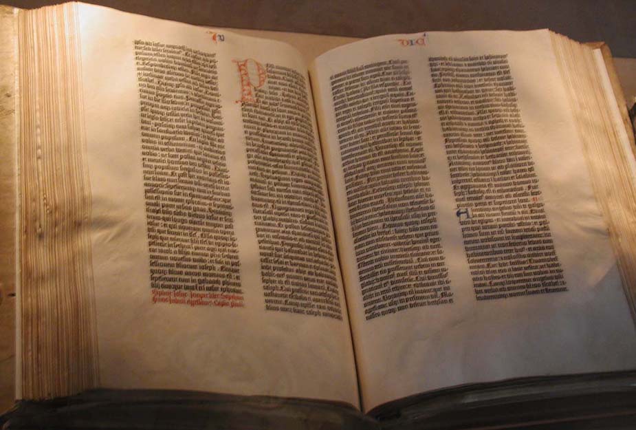
Blackletter is the technical name of the first fonts used in book printing. Early printers like Gutenberg naturally replicated the latest available fonts, which in the 15th century were late medieval forms. See, for example, the Gutenberg Bible at the Library of Congress. Blackletters are the typographic equivalent of Gothic architecture and they correspond to the style's international spread. They were used longer in Germany and are hence associated with German books. Blackletters vary greatly but are divided into four basic categories, textura, fraktur, bastarda and rotunda. They are commonly distinguished by the forms of the lower case "o." Robert Bringhurst describes their differences as follows (and illustrated above):

"Though written with only two penstrokes, the o in textura looks essentiall hexagonal. In a fraktur, it is normally flat on the left side, curved on the right. In a bastarda, it is normally pointed at top and bottom and belled on both sides. In a rotunda, it is essentially oval or round." The Elements of Typographic Style, version 3.1 (2005) p. 266.

Bringhurst gives a few examples of modern blackletter typefaces. Chairvaux was designed by Herbert Maring in 1990, based on the Cistercian abbey of Clairvaux, founded by St. Bernard in 1115. Fette Fraktur is a heavy, Romantic font designed in Frankfurt about 1850. Goody Text was designed by Frederic Goudy and issued by Monotype in 1928.

Uncial is the other prominent type of medieval script. Uncial is a lower case used by scribes from the 4th to the 9th centuries. The script was abandoned during the late medieval period and rediscovered in the 19th century by antiquarians. Due to their pre-Gothic origin, they came to represent a Romantic, early Middle Ages and captured the imagination of the early 20th century.

Blog Archive

Kostis Kourelis

Philadelphia, PA, United States