Wednesday, May 04, 2011

Dan Deibler: The Figure

F&M Art major Dan Deibler '12 decided to tackle the human body as an independent study with professor Kevin Brady. The fruits of that one-semester project were recently on display at the Phillips Museum. Six large drawings document the learning process from charcoal to large oil paintings.

The portrait on the left has been haunting me for the last few weeks. It is one of the most accomplished pieces that I've seen at F&M. I keep returning to the triangular red shirt and the triangular shadow on the face. The snap shot does not tell the full story. The oil painting has a physical reality that engages the viewer with varying psychological scales. In many ways, the real painting is the best argument for painting. Interestingly enough, Deibler is also a master of the unreal, too, in computer design. I hope Dan has no room to store this work and he will let us hang it in the Alumni House to show everyone how great art can be made.

See some more photos from Deibler's opening reception here.

Tigist Hailu transforms F&M campus

In the next few posts, I will celebrate the most thrilling projects produced by students in my department. F&M has been buzzing with artistic productions, three student openings, the senior exhibition, and the student juried exhibition (which made the local news). My favorite project happened outside the museum walls this last Monday. It involved the marriage between personal history and architectural facade.
The Art & Art History Department at Franklin & Marshall has a new tenure-track photography professor, John Holmgren. His seminar ART 372: The Camera has produced one of the most powerful transformations of F&M's campus that I've witnessed in my last two years. Tigist Hailu's final project involved the projection of historical imagery on the walls of five F&M's buildings (Shadek Fackenthal Library, Old Main, Keiper Hall, Distler House, Steinman College Center)

I quote from the official press release:

On campus Monday evening, May 2, you'll notice unusual activity starting around 8:30 p.m. in front of Shadek Fackethal Library and progressing, in turn, to a number of F&M's main buildings. The presentation, ASSOCIATION, MEMORY, TIME: SIX DECADES OF THE AFRICAN AMERICAN EXPERIENCE AT F&M, was developed to commemorate the 60th anniversary (this year) of the first African-American students to graduate from Franklin & Marshall. Tigist began her work by contacting local F&M African-American alums (selected to represent, by class graduation year, each decade of the past 60-year span). She asked the alumni to answer three questions: 1) which building at F&M did you feel more or least comfortable during your time at F&M? 2) What was your best or worse experience in the building? and 3) What was your overall experience at F&M? She invited each participant to campus to have his/her portrait taken in Art and Art History's digital studio lab.

As the final step in the process, Tigist digitally projected the imagery (photos and text) developed from her gathered material onto the facades of the F&M buildings pinpointed in her participants' questionnaire responses. The result is a stunning display that merges the concrete and the illusory, the objective and the subjective, presence and reflection.

The alumni participants were Sydney N. Bridgett '51, Louis Butcher, Jr. '65, Donna Eileen Glover '76, Monica Gantz DuBose '85, Raymond C. DuBose '84, Anthony L. Ross '91, and Nick Peterson.

The photos above are by Eric Forberger, see The Diplomat (May 5, 2011) and by Robert Diggs, see F&M Voice (May 3, 2011).

Tuesday, May 03, 2011

Parrish: Italian Villas

My colleague Michael Clapper gave a fantastic talk, "Maxfield Parrish's Constructed Fantasyland" on April 22 at the Philadelphia Museum of Art. Michael's talk is part of a larger study on the relationship between high and popular art in American culture. To understand the broader conceptual framework, see Michael's related case-studies, Michael Clapper, “Imagining the Ordinary: John Rogers’ Anticlassical Genre Sculptures as Purposely Popular Art,” Winterthur Portfolio 43 (2009), pp. 1-39, and "Making Sense of Thomas Kinkaid," Middlebury College Museum of Art (2009).

The lecture was hosted by the PMA's Center for American Art. The discussion that followed was so intense that it made me envious of the intelligence of Americanist art history as a discipline both esoteric and popular.

One of the directions towards which the discussion steered had to do with domestic architecture. Kathleen Foster (Curator of American Arts, PMA) described the material culture that would comprise the domestic interiors where Parrish's artwork would have been displayed.

The talk over domestic architecture reminded me of the Parrish drawing that I first saw at the New Britain Museum of American Art. In 1904, Parrish illustrated a book by Edith Wharton on Italian Villas and Their Gardens, a project sponsored by Century magazine (see here).

Browsing through Franklin & Marshall's Special Collections, I was thrilled to see that our library had a copy. I stopped by this week and read excerpts. The Wharton-Parrish collaboration is one of the best evidence of the magic lure of Italian domestic architecture exercised upon Americans in the late-19th and early-20th century. The operative word is not simply "like" but "enchantment." The interplay between landscape and architecture that creates this domestic magic was central to Parrish's art. To witness the magic in person, visit Parrish's mural "Dream Garden" in the east foyer of the Curtis Publishing Company Building. The mural was made by Tiffany Studios in 1916. Some of the individuals involved in saving this masterpiece from leaving Philadelphia were among the audience in Michael's talk.

To give the reader a flavor of Italian enchantment in the early American mind, I quote directly from Edith Wharton:

"The traveler returning from Italy, with his eyes and imagination full of the ineffable Italian garden magic, knows vaguely that the enchantment exists; that he has been under its spell, and that it is more potent, more enduring, more intoxicating to every sense than the most elaborate and glowing effects of modern horticulture; but he may not have found the key to the mystery. Is it because the sky is bluer, because the vegetation is more luxuriant? Our midsummer skies are almost as deep, our foliage is as rich and perhaps more varied; there are, indeed, not a few resemblances between the North American summer climate and that of Italy in spring and autumn." (p. 6)

"... and in the blending of different elements, the subtle transition from the fixed and formal lines of art to the shifting and irregular lines of nature." (p. 7)

"The cult of the Italian garden has spread from England to America, and there is a general feeling that by placing a marble bench here and a sun-dial there, Italian “effects” may be achieved." (p. 12)

Monday, May 02, 2011

Insect 1906

The southeastern staircase at the Philadelphia Museum of Art (Gallery 276B) contains my favorite insect, stenciled on a Dutch tile from 1906. Knowing that the tile was originally installed in the interior of a butcher shop makes the image even more potent. I was traveling through Schiphol (Amsterdam's airport) the year the new terminals opened (1998?), and I was impressed (if not baffled) by the flies etched in the porcelain of the airport urinals. Like a scarecrow, the stenciled fly discourages other real flies from landing on the urinal. See here.

The insect at the Philadelphia Museum of Art (PMA) was designed by Bert (Lambertus) Nienhuis for De Distel ("the Thistle"), a firm in Amsterdam. The butcher shop in which it was originally installed was located in Leeuwarden. The insect is stenciled under the tin glaze in a pale blue color. I discovered it last week on my way to Michael Clapper's fabulous lecture on Maxfield Parrish at the PMA. I had also just received a manuscript rejection that had put my thoughts on the track of butcher blocks, maggots, and academic gate-keepers. The insect cured me.

See the rest of the Art Nouveau composition, left. The thistles rise on the upper two registers; the insects dot the zones below.

I strongly encourage you to ascend this staircase for an additional reason. It leads you from the beautiful Impressionist pool to the Pennsylvania German kitchen (here). It dates to 1752 and was originally located in Millbach Township, north of Lancaster. It was acquired by the PMA in 1926 (by the du Ponts) and it is important as an installation for the history of museum. It was one of the earliest rooms reconstructed by architect Fiske Kimball, director of the PMA (1925-1955) and pioneer in house-museums. The PMA has recently re-installed a collection of Pennsylvania German objects in the room immediately adjacent to the kitchen. More objects of its kind are permanently displayed in the American collections, on the other side of the museum.

Saturday, April 30, 2011

Steel Beam Vernacular: S 40th St

At first glimpse,the floral detail on the left seems completely decorative. This particular flower springs out of a horizontal steel beam. And at closer inspection, the flower's stigma is a 6-sided bolt that locks two C-channel beams into the structure. The steel beam spans a large shop-window and supports the exterior wall of a 3-story building above, similar to the situation in 222 Chapel St. As discussed earlier, the language of flower-bolts was introduced to Philadelphia by Frank Furness. In addition to the Furness Library at Penn seven blocks away, Furness's firm designed a number of row houses a few blocks away in West Philadelphia.

I don't think that this building is a Frank Furness original, but it clearly imitates his language. This is most evident in the vertical wooden pilaster that supports the steel beam. Executed entirely out of wood, this vertical support braces the steel with the vocabulary of medieval architecture. Although less refined, it derives from the interior steel beam of Furness's Pennsylvania Academy of the Fine Arts. Like his contemporaries in Chicago (Sullivan, etc.), Furness merged Ruskinian creativity with the engineer's innovations. The end result became a distinct Furness style. The hundreds of buildings that he designed in Philadelphia, moreover, transformed this highly personal vision into a vernacular vocabulary that now characterizes 19th-century Philadelphia. The steel beams are not always evident, but I hope the last few postings have helped my readers to see them.

Friday, April 29, 2011

Steel Beam Vernacular: 4010 Spruce St

An interesting variation of the steel beam vernacular can be found in a group of row houses at 4010-4016 Spruce Street, West Philadelphia. As far as I can tell from other stylistic features, the houses date to the 1920s. They fit the Garden City development of the neighborhood.

As with the earlier examples of steel beam vernacular, the upper floors of these houses extend above the porch, an arrangement made possible by the use of structural steel. As you can see on the left, the lintel has the outline of an I-beam but instead of the Furnessian bolt-flowers it features elaborate floral decoration. At closer inspection, the decorated lintel is not structural at all, but a thin sheet of metal. A damaged limestone capital on the West side of 4015 Spruce reveals the structural detail of the ensemble, which I quickly sketched below.

What we basically have here is a pair of I-beams that span the length of the porch. Four wooden beams (which are obviously doing no structural work) are inserted in the grooves of the I-beams. A decorated metal sheet (duplicating the form of the encased I-beam) is nailed on the exterior of the porch and wooden panels are nailed in the covered side of the porch and under the beam.

What makes this vernacular solution interesting is its awareness of the the exposed I-beams of Frank Furness a generation earlier. These houses show evidence of a development in thinking about the I-beam. My conclusions here are still provisional. I haven't established the exact dates of these houses to argue for a chronological development.

Wednesday, April 27, 2011

Steel Beam Vernacular: 222 Chapel St

Structurally superior to older materials, steel could facilitate larger spans. William Le Baron Jenney developed the steel frame system in the 1890s, which facilitated the Chicago skyscraper. In all cases, however, the innovative metal structure needed to be covered to avoid exposure to fire. A generation earlier (1850s), wrought iron had been used as the primary material for tall manufacturing buildings (e.g. SoHo Cast Iron Historic District) but with great risks for fire.

In Philadelphia, the incorporation of steel in the exterior of buildings was limited but interesting in trying to marry the old language of masonry with the new language of metal. A modest building in Old City shows the process of stylistic incorporation. The building is located around the corner from the historic Christ Church, at 222 Chapel Street. It is a four story brick building with traditional stone lintels spanning the windows on the upper stories. On the first floor, where a shop front would have existed, the vernacular architect has placed a long horizontal steel beam to support the upper brick façade. Although redundant, two wrought iron columns bring an interesting twist. Their capitals are Byzantine and inspired from Ruskin’s Stones of Venice (1853). In addition to its material innovation, 222 Chapel Street testifies to the significance that Ruskin’s Byzantium played in the creative development of American culture.

We have already mentioned that Frank Furness was the first American architect to unite the steel beam with the decorative vocabulary of traditional materials. Our steel beam shows the Furnessian touch of making a practical steel bolt into a flower, thus bridging the gap between new technology and tradition. Tomorrow, I will show you another great example of this floral bolt detail from West Philadelphia.

Tuesday, April 26, 2011

Steel Beam Vernacular: Philadelphia

The incorporation of steel beams in the visual language of American architecture begins with Frank Furness. Historians credit his Pennsylvania Academy of the Fine Arts (1871) as the first building to use exposed steel beams and to incorporate the new riveted technology into the decorative language. This is evident in the PaFA’s interior galleries, where horizontal steel lintels are married with Furnessean capitals. The connective rivet inside the beam channel turns into a rosette.

Over the last couple of weeks, I’ve been tracking the application of the exposed steel beam in the vernacular architecture of Philadelphia. The Philadelphia row house is known for its continuous front porch. Anyone that has spent a summer in Philadelphia understands the necessity of such a feature and the climatic allegiance that the city holds with the South. Although Pennsylvania joined the Union, Philadelphians were split in their allegiance to the Confederacy. In the 19th century, Philadelphia flourished as the gateway to the southern markets.

Philadelphia’s porches are structurally appended to the brick structure of the house. Made of wood, these porches are the first victims of deterioration and collapse. Their sloping roofs keep the water outside the raised platform but support no additional weight. I haven’t yet established the precise dates, but some developer in the 1890s had the following idea. If the porch can be structurally more substantial, then it can support a floor. In comes the steel beam. Using steel rather than wood, allows for the second and third floor of the brick house to extend all the way out to the street and increase the house’s interior square footage. The steel beam that replaced the wooden beam became a site of pride and articulation. The row houses that introduced this element left the steel beams exposed. Using the architectural language developed by Frank Furness, they juxtapose chubby vertical stone columns with slender steel lintels.

Like the almost contemporary examples of steel beam expression from Greece, this Philadelphia innovation reveals the experimental ingenuity of vernacular architecture. In Philadelphia, professional firms (like Furness and Hewitt) were involved in residential development. Hence the interface between aesthetics and domestic application are not surprising.

Although this is by no means complete, here are the addresses in West Philadelphia with the finest examples of steel beam row houses.

219-233 S. 45th St
4010-4016 Spruce St
4500s Springfield Ave
4500s Baltimore Ave
419-421 S 40th St
4305-4311 Locust St

Monday, April 25, 2011

Steel Beam Vernacular: 1910s Greece

Revealing structural material to the viewer is central to a tradition of architecture that begins with Viollet-le-Duc’s structural rationalism and culminates to contemporary High Tech. Mies van der Rohe’s Barcelona Pavillion (1929) marks the ultimate aesthetization of the steel beam, which extends into Mies' invention of the American skyscraper in the 1950s (Seagram Building, etc.) As far as I know, few studies have looked at the early use of steel beams in vernacular architecture. In this post, I will explore a phenomenon from rural Greece that illustrates the porosity of vernacular architecture. This phenomenon is striking for the incorporation of modernist aesthetics before those aesthetics were formally canonized. If you look closely at the picture on the left, you will note a gray steel beam between the stone pillaster and wall. Just above the left corner of the pilaster capital, you can also see a rivet within the channel of the beam. The picture is taken from the Old Public School of Arachova in Central Greece. In the next post, I will discuss a contemporary phenomenon in the vernacular experiments of Philadelphia row houses.

While mapping villages in Greece last summer, I became aware of one consistent feature in the elevation of public buildings from the 1910s to 1930s. Many buildings seem to have incorporated steel lintels and, more importantly, made this incorporation a visible component of their exterior elevations. An ubiquitous number of I-beams are integrated in the stone architecture of Greece. They are not part of a steel structural system, but rather assist in spanning large opening within a traditional stone idiom. Whereas wooden lintels or arches continued to serve the needs of domestic architecture, buildings like new schools or shops benefited from larger opening that could only be facilitated by steel. A closer inspection of the masonry openings in the school (left) shows that even when the openings featured flat arches, they were structurally assisted by hidden steel elements.

This material shift is particularly evident in rural schools built by Eleutherios Venizelos in the 1910s. They are typically built in finely cut local stone that suggests that the building grew out of the regional terrain. The stone is bluish-gray and finely dressed. A unified surface of ashlar blocks contrasts with the taut window surfaces and the steel lintels. Although they blend with existing vernacular traditions, these public buildings stand out. I would not go as far as to argue that they are iconic, but we must remember that mandatory elementary education was instituted by Venizelos in 1911 by constitutional reform. Since every Greek child was suddenly obliged to attend school, the government needed to provide requisite spaces. The schools are utilitarian in nature and employed local craftsmen. As architectural works, however, they communicate a whole set of new ideas to the local agrarian population. On the West facade of the Arachova School, we see two-story industrial windows that facilitated large luminous spaces that wooden could not have never facilitated. The tension between old and new is very interesting and an important expression of the dialectics between public education and local society or between International Style modernism and local solutions.

Looking at the Main Streets of many towns like Arachova, we also note the steel technology was also used to create large shop windows and expand the commercial character of the central thoroughfare. The steel beams here assist in dissolving the wall between seller and buyer and bring the transparency of Walter Benjamin's arcades to the mountain town. The picture on the left might be hard to decipher; it shows a shop entrance. Local building styles, like the segmented arch (stone interspersed with brick) or the ashlar pilaster (with rusticated surfacing), meet the new steel beam. In terms of architectural development, the steel beam is simply taking the place of a wooden lintel. But its visible manifestation on the exterior seeks to mark the muscular optimism of industrial modernity.

Some of the Venizelos schools have highly rusticated walls, a phenomenon that warrants its own study. Although vernacular architecture may be generally considered "rustic," the stylized rustication of 1890s-1920s public buildings in Greece originates from academic sources (Renaissance models, like Palazzo Medici). The Greek train stations were designed by French engineers in the 1890s and feature rusticated masonry of this sort, as do engineering projects like bridges and walls. A similar rustication was used in suburban villas (Kephisia, Patras, etc.) replicating European picturesque prototypes. Whether used in private or public works, rustication seems to trickle into 19th-century Greece via a European channels.

We must return to the steel trabeation of Venizelos' schools. With their larger spans, the steel beams allow for large window openings and effectively “modernize” the educational experience of teachers and students. School houses before the 1920s were exactly that, houses. A recently renovated example of a school house with a hybrid steel-stone construction is found in the prosperous town of Arachova near Delphi (above). Although I have not done an exhaustive study of this modernist incorporation in vernacular Greek architecture, it is in Central Greek that I first became aware of it. This is important because, unlike the Peloponnese, the bulk of mainland Greece did not join Greece until Venizelos' times (cf. Greco-Turkish War of 1897)

One instance where the publicly visible steel beam entered domestic architecture is the house of Angelos Sikelianos and Eva Palmer-Sikelianos (left). The house, which was built by funds raised by Palmer in the U.S., became the anchor of the Delphic Movement. Recently renovated, the house is now a museum and contains an incredible collection of ephemera from the Delphic Festival, including costumes woven by Palmer for Prometheus Bound. One problem with renovations is that you can not tell how aggressive they may have been. The balcony on the second floor is supported by steel beams. Greek restorers have tended to strip facades down to the bare stone. So, I’m not 100% sure whether the steel beam might have been covered (like the rest of the façade) with stucco.

At any rate, the incorporation of modernist elements in vernacular architecture raises a host of interesting questions regarding the international relationship between new materials, new ideas and channels of transmission.

Tuesday, April 12, 2011

Colonial Revival (among students)

While my 1930s Architecture seminar students conduct their research on the campus architecture of William Lee, we had a chance to contemplate a new colonial revival building that was just completed at F&M's campus. The New College House was designed by Robert A. M. Stern and adheres to the traditionalism of Stern's campus buildings, anthologized in a new monograph Robert A. M. Stern: On Campus (2010).

The Stern commission has already received some critical attention in the Chronicle of Higher Education, but I will not review the debate here. Instead, I thought I might solicity my students personal opinions. Over dinner at Iron Hill, we went around and shared first impressions. I am including some of the responses below, which were overwhelmingly positive. We then proceeded to read William Rhoads classic essay, "The Colonial Revival and American Nationalism," in the Journal of the Society of Architectural Historians 35 (1976), pp. 239-254, and asked not who embraced the Colonial Revival as our national style, but rather, who had serious problem with it. As early as 1886, for instance, Mariana Griswold Van Rensselaer, argued that the Shingle Style is more appropriate for an American style (Rensselaer is best known for her early monograph H. H. Richardson). We then extended the discussion to broader contemporary questions, such as, the associations of slavery that an African American student might have with this style, or the associations of Imperialism that an international student from India might provoke.

STUDENTS' INITIAL RESPONSE TO THE COLONIAL REVIVAL COLLEGE HOUSE

I personally like the colonial revival style and feel that it is appropriate for the college to use. One of the attractive aspects of this style is the sense of familiarity and homey-ness it can give off. Often people who are looking at something like modernism get the impression of it being very cold. Although one might not be able to extract the exact references the architect was referring to when constructing the building, there still remains this sense of familiarity. One can recount the same design of columns and brick in our own towns or famous American landmarks. For the college student who may be away from home for the first time and in a completely new environment, seeing something as simple as a familiar architectural style can be comforting.

I think the new college house is an excellent example of colonial revival style. It truly does incorporate the defining characteristics of an elaborately decorated front door with a Greco-Roman portico and symmetrical arranged windows. The building itself is also completely symmetrical. After going on a tour of the building and learning that most of the features like the columns are machine-made woodwork I thought these building follows the colonial revival style even further. I think it’s an interesting addition to the college architecture and landscape. It definitely stands out but still in some way fits with William Lee’s original plan to put every building in a uniform style.

Colonial Revival buildings always made me feel very comfortable. It’s beautiful without being haughty, and has a sense of history attached to it without seeming too old. I think it’s maybe that Colonial Revival buildings are usually relatively simple in their design, but still have enough decoration to feel elegant and comfortable. Maybe most of these feelings are because I’m from Connecticut, where colonial revival style has always been quite present, but the style just feels very homey to me, while at the same time inspiring my appreciation for its beauty. I don’t think the feelings that I have are very unique, which might explain the continued prevalence of Colonial Revival style at colleges. If you have to be far from home and alone, it helps if the style of the buildings reminds you of your country’s roots. I’m not sure how that affects international students, but maybe that’s not who the college is aiming for.

The colonial revival style of the new college house is fitting within Franklin & Marshall College’s campus. Consistency of college architecture is grounding and can be a sense of comfort for students during a turbulent stage of their lives. This can mean that all buildings are consistently the same or all buildings are consistently diverse. Long ago, F&M chose to be uniform and is now bound to this plan, unless serious funding arises to create a more architecturally diverse campus. Even the more modernist buildings like Stienman College Center or Hackman science center were architecturally restrained to blend in. The Colonial Revival itself is very homey for native East Coast students where the style is prevalent among residential buildings. Those from a far who seek a little, New England, liberal arts college are well rewarded with the consistency of the Colonial Revival at Franklin & Marshall.

Friday, April 08, 2011

Slam!

There's nothing like the plastic sound that my antiquated cell phone makes when I close its flap. My toddler loves to open and close it and occasionally have her finger stuck. I also love the sound my phone makes when I accidentally drop it and it splatters into three parts: the body, the battery, the battery case. Call me corporealist, but the iPhone is too ethereal. Back in 1994, Umberto Eco argued that Macintosh is Catholic while DOS is Protestant, but I suspect he has changed his mind about the analogy. The i-products are Platonic. They are everywhere and nowhere.

Michael McGettigan, owner of Trophy Bikes, has been a powerful force in Philadelphia's cycling community. He's also been a pioneer in the rediscovery of the mechanical world that once included typewriters. Last December, Michael organized the first "Philadelphia Type-In" at Bridgewater's, the pub at 30th Street Station. I cannot imagine a better acoustic space to encapsulate the mechanical past than Pennsylvania Station in Philadelphia. The even was repeated in February. Unfortunately, I've divested myself of all family typewriters. I'm possibly one of the last people of my generation to have taken a typing class in junior high-school. Watching the third episode of Mad Men, I also wish I had learned stenography, too.

The clicking and clacking of the mechanical world of literary production received a nice spread in the New York Times, and Philadelphia got the international attention usually afforded to Brookly, see Jessica Bruder, "Click, Clack, Ding! ... Sigh," NYT (Mar 30, 2011).

Bonnie Halloran

I haven't been blogging much about one of my major research projects this current year, an exhibition of Georg von Peschke paintings from 1930s Greece. It's been a wonderful project with lots of help from friends an colleagues. F&M is excellent in providing funds for undergraduate research, including a summer-long collaborative fellowship, the Hackman. Having a Hackman students is like having a graduate student for the summer. Halloran worked with me on Peshcke May-July 2010. She decoded Richard Stillwell's travel diaries from 1921, she transcribed interviews with the von Peschke's family, she interviewed archaeologists, she traveled to Greece, researched at museums and collections of modern Greek art, visited archaeological sites, and joined a field school that I started with Todd Brenningmeyer dedicated to mapping medieval and early-modern sites (Glarentza, Tegea, Taxiarches, Lidoriki). So far, I have blogged about neither the Peschke research nor the mapping project, but I do want to highlight Bonnie's profile today in the F&M journal, see "Rediscovering Forgotten Art," The Diplomat (Apr. 7, 2011).

In addition to being one of the finest students in our department, Bonnie is one of the most serious students of Arabic (and Islamic art) in our college. This summer, Bonnie received a Critical Languages Scholarships, a super-competitive award granted by the U.S. State Department to continue advanced studies of Arabic. Bonnie is taking my 1930s seminar this semester and she will continue working on the Peschke and the 1930s as a Mellon Foundation fellow at the Phillips Museum.

If any of you are at F&M next Friday (Apr. 15), don't miss the Research Fair. Bonnie will be speaking on her Peschke research. Another student of mine, Caitlyn Frank, will be presenting her research on Islamic aesthetics during the Civil War based on her analysis of two mausolea at Laurel Hill Cemetery in Philadelphia.

Wednesday, April 06, 2011

Colonial Revival 1930s

My 1930s Art History seminar is embarking on a study of William Lee's architecture at Franklin & Marshall. Shadek-Fackenthall Library and Keiper Hall retained the Colonial Revival idiom set into place by Charles Klauder 1924 master plan, but I hope that my students will reveal the buildings' subtleties.

At the same time, the New York Times Style Magazine announced a forthcoming exhibit at the Museum of the City of New York, "The American Style: Colonial Revival and the Modern Metropolis" (June 14 - October 30). I was thrilled to read Douglas Brenner's review because it reinforced the premise of my seminar, that a multiplicity of competing styles enlivened the architectural debate of the 1930s in ways that traditional histories underestimate. Art Deco and the International Style were only two voices among others.

Williams Rhoads seminar article sets the stage of early scholarship, "The Colonial Revival and American Nationalism," Journal of the Society of Architectural Historians 35 (1976), pp. 239-254. Without a doubt the Colonial Revival exercised ideological muscle. It provided new points of reference for different people in an overwhelmingly traditionalist and occasionally racist tone. After 1924, a traditionally German college embraced the Georgian Revival style for its modern identity. The conservative choice has left F&M in a peculiarly apologetic predicament. Its planner, Klauder, was mysteriously fired in the 1930s. Some claim it's because the college discovered that Clauder recycled his designs for Penn State and the University of Delaware. F&M seems trapped in layers of copying, whether we call it appropriation or plagiarism. Its new college house is almost complete. A Colonial Revival Revival building designed by arch-traditionalist Robert Stern now towers over the college's north entrance. Its completion will certainly generate some discussion.

Friday, March 25, 2011

Ancient Electric Lights

Obviously, the ancient Greeks and Romans did not have electric lights and light fixtures. If you happened to be a neoclassical architect in the early 20th-century, you were confronted with a new design problem. I have been looking at a number of neoclassical light fixtures admiring the ingenuity of their solutions. One example is the light fixture at Lancaster's Railroad Station, designed in 1929 (above), which plays with the ornamental motifs of the railing. Two lines that float like waves, bow out and intersect symmetrically, producing shapes that resemble the infinity symbol, the figure eight, or a curvy "x". The oscillating wave motif reminds us both of the marine inspirations of the classical vocabulary, but it also mimics the magnetic wavelengths of magnetism and electricity. This double reading collapse antiquity into modernity. See similar observations in my Train Wave posting.

Another light fixture that utilizes this motif was found in the reading room of the Shadek-Fackenthal Library at Franklin & Marshall (William Lee, 1937). The fixtures were removed during the 1980s renovations, but Christopher Raab at F&M Special Collections has shown me photos.

During the "Liturgy and Migration" conference at Yale, I got to spend some quality time at the Yale Divinity School, which was designed by Delano & Aldrich, the industrious neoclassical firm. The exterior is modeled on Thomas Jefferson's UVA campus, but it has a highly surreal sensibility. The exterior walkways that connect the pavilions are lit by a beautiful light fixture that takes the intersecting wave motif and lets it circulate freely around a cylinder. For readers of this blog affiliated with the American School of Classical Studies at Athens, consider the following connection. Charles Spector and Joseph Shelley, architecture fellows at the American School in 1931, worked for Delano & Aldrich.


Monday, March 21, 2011

Lovecraft's Byzantium

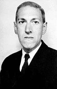
H. P. Lovecraft is a cult author of “weird fiction” from the 1920-30s. Although I had heard of the name, I didn’t become interested in Lovecraft until Matthew Sweet's interview of novelist China Mieville and journalist Suzi Feay on BBC's Nightwaves (Oct. 20, 2010).

For the last three months, I’ve been feasting on Lovecraft’s short stories. His grotesque apocalyptic visions help us understand modern American anxieties in the light of Gothic fiction and the inheritance of Edgar Alan Poe. What I also find most enlightening is the persistence of archaeology in the form of both archaeological knowledge but also the inclusion of archaeologists as characters. “At the Mountains of Madness” (1931), Lovecraft’s longest story, we read about a fantastical campaign, the Miskatonic University Expedition to Antarctica. Partially written in the form of expedition reports, the explorers discover an unknown species, as well as the civilization of the “Old Ones” that flourished before the Pleistocene geological age.

Lovecraft’s own archaeological scholarship creeps dominantly through the narrative (Eckhardt 1987) and includes reference to late antiquity and its use of spolia. Lovecraft compares the sculptural reliefs of the Old Ones with the decadence of Constantinian art, which he partially acquired from general 1920s art-historical notions but more specifically from Oswald Spengler’s, The Decline of the West translated into English in 1926 and 1928. Along with Joseph Wood Krutch’s, The Modern Temper (1929), Spengler influenced Lovecraft’s transition from classicism to Decadence to a sort of antiquarian regionalism and finally to the science of weird fiction (Joshi 2001, 297-305). The decadence of Byzantine art that Lovecraft cites takes on a positive role in reconstructing the civilization of the Old Ones.

“Art and decoration were pursued, though of course with a certain decadence. The Old Ones seemed to realize this falling off themselves; and in many cases anticipated the policy of Constantine the Great by transplanting especially fine blocks of ancient carving from their land city, just as the emperor, in a similar age of decline, stripped Greece and Asia of their finest art to give his new Byzantine capital greater splendours than its own people could create. That the transfer of sculptured blocks had not been more extensive, was doubtless owing to the fact that the land city was not at first wholly abandoned. By the time total abandonment did occur – and it surely must have occurred before the polar Pleistocene was far advanced – the Old Ones had perhaps become satisfied with their decadent art – or had ceased to recognize the superior merit of the older carvings. At any rate, the aeon-silent ruins around us had certainly undergone no wholesale sculptural denundation; though all the best separate statues, like other moveables, had been taken away” (Lovecraft 2005, 555)

Lovecraft has witnessed a revived interest in 2010. News had it that Guilermo del Toro was directing a film version of "Mountains of Madness," produced by James Cameron and starring Tom Cruise. As of early March, unfortunately, Warner Bros. has pulled the plug on this $150 million project. See here and here.

“The Rats in the Walls” (1924) is another Lovecraft stories that involves an archaeological expedition, but I will discuss it in a future posting. I must also warn the reader that during my Spring Break, I’ve been thinking about a strand of New Wave rock from the 1980s that marries the dark vision of the Gothic tradition with a post-punk musical precision. I’ve been thinking about the archaeological layers of The Cure, for example, and trying to weave a thread of archaeological Orientalism that ties Bob Dylan’s “Isis,” David Bowie’s “Aladdin Sane,” The Cure’s “Fire in Cairo,” and Peter Murphy’s (of Bauhaus) Muslim conversion and migration to Turkey.

LOVECRAFT CITATIONS:

- Eckhardt, Jason C. 1987. “Behind the Mountains of Madness: Lovecraft and the Antarctic in 1930,” Lovecraft Studies 6 (Spring), pp. 31-38.
- Joshi, S. T. 2001. A Dreamer and a Visionary: H. P. Lovecraft in His Time, Liverpool.
- Lovecraft, H. P. 2005. Tales, ed. Peter Straub (The Library of America 155), New York.

Friday, March 18, 2011

Tyng Toy 1949

The Institute of Contemporary Art (ICA) is hosting a small show on Anne Tyng, the pioneering engineering partner of Louis Kahn. Tyng taught at Penn's architecture school for many years where many got to know her. She was truly one of the toughest critics. The show would offer no surprises to those who know the modern architectural scene of Philadelphia. Tyng's case continues to raise some critical gender questions. Tyng was the first female graduate of Harvard's engineering program, and a student of Buckminster Fuller. Her relationship with Kahn was both professional and emotional, as she fathered one of his children. Those that have seen Nathaniel Kahn's My Architect (2003) will remember that Kahn had three separate families resulting from his affairs. Tyng's contribution to Kahn's City Towers (1952-57), the Yale Art Gallery (1952), and the Trenton Bath House (1955) are amply visible in the show. Tyng has published the letters that she exchanged with Kahn when he was a fellow at the American Academy in Rome in Louis Kahn to Anne Tyng: The Rome Letters, 1953-1954 (1997). I haven't read them yet, but I look forward to learning more about their relationship. During this second fellowship in Rome, Kahn visited ancient Corinth and produced a set of fascinating drawings of the Temple of Apollo -- but I have to leave this for another installment of the intersection between Corinthian archaeology and the avant-garde.

The ICA's "Anne Tyng: Inhabiting Geometry" makes a great case for the autonomy of Tyng's engineering vision. Her Elementary School (1950-51), the Rev. & Mrs. Tyng House in Cambridge, MD (1952), and the Four Poster House (1975-84) are wonderfully modest in their application of abstract geometries on the terrains of everyday life. The house extension built for her parents is also interesting in the ways that the new triangular inventions are integrated with the triangular forms of American colonial architecture.

For me, the greatest discovery in the ICA show was a b/w brochure that accompanied Tyng's contribution to the arts of children. The TYNG TOY of 1949 needs to be included in the pantheon of mid-modern toys. The toy was a kit of plywood parts that could be assembled into a variety of ensembles. I sketched the primary 5 parts above and copied the text-description of the brochure. This project makes Tyng an equal of Ray and Charles Eames or Isomu Noguchi, who took children's education seriously and softened the male machismo of modernism. Knowing Kahn's relationship to domestic life, we could never imagine him designing a toy. He spoke endlessly of his upbringing and his formative democratic experiences in Philadelphia's public spaces. But he never brought it home. We cannot help to see Kahn as the male genius of insatiable sexual desire but little time for domestic responsibilities. Tyng, in contrast, brought high geometry to the home in an entirely different way. As a mother and struggling architect, she never received the recognition that she deserved. The ICA show helps a bit in bringing Tyng back into focus.

Blogger Glenn Allen provides some good visual illustration in "Holy Smokes! It's the Tyng Toy," Daddytypes.com (Oct. 13, 2009).

Thursday, March 17, 2011

Consuming Art: The Black Middle Class

Franklin & Marshall's Emerging Scholars symposium this year was dedicated to Identity. All the papers were amazing, but Patricia Banks' "Represent: Art and Identity Among the Black Upper-Middle Class" was the one that struck some chords with my research. It was a pleasure to meet Patricia and initiate some comparative discussions with the Armenian- and Greek-American middle classes. Symposium lunch turned into a workshop with Sylvia Alajaji, Susan Minasian, and I capitalizing on Banks. Thanks to Laurie Baulig and F&M's Center of Liberal Arts & Society for making this forum possible.

Banks is a sociologist at Mount Holyoke College. Her talk was based on her dissertation, published last year (order it for your libraries here). Banks interviewed over 100 black art collectors in Atlanta and New York and has documented a typology of patronage, collecting, and re-presenting. Black artistic patronage is caught up with a race of legitimation and story-telling focusing on distinctly black narratives. Most striking is the prominence of figurative representation with abstraction entering the home only when the motifs have clearly African folk origins. As one might have expected, the black middle class stays clear of any controversial art. There is very little Glenn Ligon or Kara Walker and there is no attempt to address the vibrant cultural production of the ghetto. While the white middle class becomes obsessed with pimps, hoes, bling, and gangstas, the black middle class wants to keep it out of the home. The art of the middle class is conservative, occasionally bordering kitsch. Glenn Ligon's retrospective just began at the Whitney, following the Kara Walker retrospective. The black middle class is clearly not in-step with the Whitney. Like all middle class minorities, they will not take artistic risks. They will collect only after legitimation has occurred by a dominant authority, in this case, the (predominantly) white art world.

Franklin & Marshall's owns the collection of one of America's greatest black Abstract Expressionists, Bill Hutson. Hutson was a faculty member in the Art Department at F&M. One of our art history students, Jessica Jackson, spent last year conducting an oral history project documenting Hutson's artistic and social struggles. Black artists were ostracized in the 1960s if they chose to use the language of abstraction. Patrons like Spike Lee have categorically rejected any black art that does not reflect some political (read: figurative) black content.

Hutson's story and Banks' analysis are particularly interesting with a recent news item on the art collection of the White House, see Randy Kennedy, "This Museum Has a Lived-in Look," New York Times (Mar. 16, 2011). The item of interest is the following incident: "When the first lady changed her mind in 2009 about hanging a painting by the African-American artist Alma W. Thomas in her office, some critics accused her of giving in to conservative commentators who criticized the painting as a fraud because it reworked and paid homage to a famous Matisse collage. The first lady’s office took great pains to say that the removal had nothing to do with politics; the painting just didn’t fit the space where it had been intended to hang." Alma Thomas' Watutsi (Hard Edge) --above-- was painted in 1963 and corresponds with the Hutson's period of abstract work. Watutsi resembles Matisse's collage Snail (1953) -- left-- but the issue of "plagiarism" that dominated the media coverage is less interesting. What is more interesting is America's general discomfort with abstraction. Forget about the issues of collage, which is by definition a derivative genre.

The moment that art becomes "representational" of identity it is reduced to a boring equation, it becomes illustrative. As Kara Walker or Glenn Ligon has taught us, identity is produced through the production of art not through its consumption. Since the birth of modern art, the Avant-Garde had a special relationship with the Middle Class, which it tended to critique and try to shock. The incorporation of the avant-garde into the mainstream is an old story, but it's a central part of the Art Story. To look at art simply as a sociological illustration provides an important slice, but it robs it of its essential function. The postmodern critique might in fact take the argument a step further and argue that art is ONLY a process of legitimizing the middle class. In the 1960s, sociologist Pierre Bourdieu studied the French middle class and produced one of the most influential studies of art and sociology, Distinction: A Social Critique of the Judgment of Taste (1979). Banks wants to argue that class is too thin of a lens. Building on Bourdieu, she has adds the lens of race. It's a wonderful contribution, but at the end of the day, the processes of class trump race. To put it another way, race may provide the narrative content but class still commands the appropriative process.

Tuesday, March 15, 2011

Kypseli: Salon de Vortex

Kyspseli is one of the most densely populated neighborhoods in Athens and in the world. Developed in the 1920s, Patesion Boulevard stretched a new modern identity for the expansion of Athens north of the archaeological museum and the polytechnic university. During the "golden" age of the 1960s, Patesia and Kypseli defined a new metropolitanism. To use American terminology, these neighborhoods experienced "white flight" in the 1980s and 1990s. Today, they represent loss of control, economic degradation and the incoherence that ensues when the middle class flees to the (yet further) northern suburbs. The Kypseli of today is a new animal perhaps as interesting as its older moments of the 1920s garden city or the 1960s dense metropolis. See my earlier post on 1920s Patesion here. Like much of downtown Athens, Kypseli is a laboratory of globalization. Greeks are a visible elderly minority of landlords. Asian, African and Central European newcomers are calling the shots.

I was born in Kypseli. While visiting my sister in Kentucky yesterday, I looked at an old family album showing me as an infant in 1969 on our thin Kypseli balcony. Forty years later, I find myself owning that balcony, inherited from my father who bought it with his first savings. When my wife and I visited Kypseli this summer, we felt quite at home with the ethnic mix of the neighborhood. It feels a lot more like our hood in Philadelphia than any other place in Greece, although the human density, mechanical noise, and dog-shit still took us by surprise. We basically had to decide as a new family unit whether to keep the tiny apartment or sell it. We decided to keep it, despite the financial burden it will impose. And we find ourselves in Kypseli as our Greek base and a future place of reference for our two-year-old, we pay close attention to the neighborhood vibe. Who knows? A returning 1.5th-generation Greek-American, his American wife, and 2nd-generation Greek-American toddler might be part of the new global soup of Kypseli.

Thanks to the web, I can keep track of my new old neighborhood. A few months ago, the renovations of Mars Field Park were completed. This rare patch of park land was looking rather shabby in the last decade as urban resources ran out. See article by Demetris Regopoulos "Patesion Street starts believing in itself again," Kathimerini (Feb. 2, 2011). Other installations have sprung up.

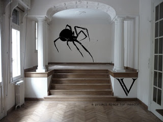
Most interesting, a trio of Kypseli inhabitants are recognizing the new vitality of the neighborhood and through the medium of art seek to build a bridge between the Kipseli of now and the intellectual Kipseli of the mid-century. They are two artists and a writer, Giannis Isidorou, Giannis Gregoriadou and Katerina Eliopoulou, founders of the art space SALON DE VORTEX on Ithakis 24 (and I. Drosopoulou). Salon de Vortex's mission statement includes engaging the neighborhood's global present. Salon de Vortex makes me particularly excited because it happens to be housed in the office of Kostas Kitsikis, one of Greece's premier modernists. Since I haven't yet visited the gallery, I don't have much to report on first hand. Salon de Vortex founder Isidorou published an opinion piece in Kathimerini that intrigued me. I quote the whole editorial here. It is entitled "Why We Chose Kypseli"

Giannis Isidorou, "Γιατί προτιμήσαμε την Κυψέλη" Kathimerini (Feb. 5, 2011)

"Tο project space salon de vortex είναι ένας νέος αυτοδιαχειριζόμενος χώρος στην Κυψέλη, που σκοπεύει στην παρουσίαση και ανάδειξη συλλογικοτήτων και συνεργασιών από τον χώρο των εικαστικών, της ποίησης και του κοινωνικοπολιτικού στοχασμού, με επίκεντρο την αναπτυσσόμενη ανεξάρτητη σκηνή στην Ελλάδα του 21ου αιώνα. Εγκαινίασε τη λειτουργία του με την κοινή μας έκθεση με τον Γιάννη Γρηγοριάδη και τίτλο «Μοφερισμός μια πρώτη αποτίμηση», στις 20 Ιανουαρίου του 2011 (διάρκεια έως 18 Φεβρουαρίου).

Το «παγκοσμιοποιημένο σκηνικό» και οι τομές της καθημερινής ζωής είναι τα στοιχεία που χαρακτηρίζουν την περιοχή της Κυψέλης. Η πυκνή κατοίκηση, η διάσπαρτη αγορά, οι πολυκατοικίες με την πλούσια τυπολογία, τα ρετιρέ και τα θυρωρεία, η ορθολογική πολεοδομία μαζί με τα κτίρια Μπαουχάουζ και τα ανακαινισμένα νεοκλασικά, η ήπια χρήση των χώρων διασκέδασης και η διατήρηση του δημόσιου χώρου, ορίζουν τη γειτονιά ως αναφορά της καθημερινότητας και ως κυρίαρχη χωρική κλίμακα. Ταυτόχρονα, η ταξική και ηλικιακή διαστρωμάτωση, οι δραστήριες και σε μεγάλο βαθμό αφομοιωμένες αλλοδαπές κοινότητες, οι πολυσύχναστες πλατείες, τα ποικίλα επιτηδεύματα, δημιουργούν μιαν πολυεπίπεδη συνύπαρξη και ένα φορτίο εντάσεων, που με τη σειρά του διαμορφώνει το κατεξοχήν αστικό πεδίο δράσης της τέχνης. Στην Κυψέλη, όπου έζησαν πολλοί ποιητές (Ελύτης, Σαχτούρης, Εγγονόπουλος, Γκάτσος, Δημουλά), λειτουργούν και άλλοι χώροι τέχνης, στεγάζονται εργαστήρια καλλιτεχνών, καθώς και τα ιστορικά θέατρα και πολλοί κινηματογράφοι.

Μαζί με τα πρακτικά πλεονεκτήματα της περιοχής, την εγγύτητα με το κέντρο της πόλης, η Κυψέλη φαίνεται να κερδίζει μια νέα αίγλη, μετά και διά μέσου της παρακμής των δύο δεκαετιών που έκλεισαν τον 20ό αιώνα. Βιώνοντας και ερμηνεύοντας σε βάθος χρόνου τα παραπάνω, θεωρήσαμε ότι η λειτουργία ενός ανεξάρτητου χώρου για την προβολή της ελληνικής εικαστικής σκηνής, της ποίησης και του κοινωνικοπολιτικού στοχασμού, θα μπορούσε να ενταχθεί και να συμβάλει δημιουργικά στον χαρακτήρα της περιοχής."

Good luck guys!!! From a distant new neighbor. Anything I can do from the U.S.?

Thursday, February 03, 2011

Bojangles Reconsidered

Back in December, I blogged on Fred Astaire's Bojangles routine in "Swing Time" (1936), see Astaire Shoes, Dec. 5, 2010, and Bojangles in Harlem, Dec. 2, 2010. I stirred clear from the problematic racial questions that Astaire's blackface raises, but I'm happy to see that they were tackled this weekend by Alastair Macaulay, "Astaire the Artist, Even in Blackface," New York Times (Jan. 27, 2011). The article argues convincingly that we should take the routine as a celebration of Bill Robinson and not as a derogatory minstrel show. The NYT article was an additional treat because it included the photo (left) from the shooting of the Bojangles dance. Astaire is here posing on the architectural model of Harlem that was featured in the background of his dance.

I am not a dance or film specialist, so I was glad to have two bibliographic suggestions. In Macaulay's words, "No performer in dance is more refreshing than Astaire. And no better companions to his art exist than the two reissues from the Educational Publisher: “The Fred Astaire and Ginger Rogers Book” by Arlene Croce (originally from 1972) and “Astaire Dancing: The Musical Films” by John Mueller (1985).

The reason for studying "Swing Time" originally was organizing my 1930s art history seminar, which is moving along into its third week. To be honest, we have spent the first couple of weeks in the late 1910s and 1920s, surveying developments in the American avant-garde focusing on Duchamp's New York, the cult of Manhattan (Joseph Stella, the film Manhatta) and, finally turning to Charles Demuth in order to bring modernity back to Lancaster. Last week, I guest-lectured in "Constructing Sexualities: LGBTIQ Theory, Life and Culture," one of the most popular courses at F&M, and took the class to Washington D.C. to see the controversial "Hide/Seek: Difference and Desire in American Portraiture" at the National Gallery. The exhibit offered the opportunity to turn our full attention on Demuth, the gay protagonist of Lancaster's modernism. On Saturday, the class goes to the Whitney in New York to see "Modern Life: Edward Hopper and His Times." The highlight of this trip for me will be seeing Demuth "My Egypt" in person, as well as taking my wonderful students to the RCA Building, the Chrysler Building, the Empire State Building, the Radiator Building, the McGraw Hill Building and other Deco treasures.

Blog Archive

Kostis Kourelis

Philadelphia, PA, United States