Showing posts with label Details. Show all posts

Friday, April 29, 2011

Steel Beam Vernacular: 4010 Spruce St

An interesting variation of the steel beam vernacular can be found in a group of row houses at 4010-4016 Spruce Street, West Philadelphia. As far as I can tell from other stylistic features, the houses date to the 1920s. They fit the Garden City development of the neighborhood.

As with the earlier examples of steel beam vernacular, the upper floors of these houses extend above the porch, an arrangement made possible by the use of structural steel. As you can see on the left, the lintel has the outline of an I-beam but instead of the Furnessian bolt-flowers it features elaborate floral decoration. At closer inspection, the decorated lintel is not structural at all, but a thin sheet of metal. A damaged limestone capital on the West side of 4015 Spruce reveals the structural detail of the ensemble, which I quickly sketched below.

What we basically have here is a pair of I-beams that span the length of the porch. Four wooden beams (which are obviously doing no structural work) are inserted in the grooves of the I-beams. A decorated metal sheet (duplicating the form of the encased I-beam) is nailed on the exterior of the porch and wooden panels are nailed in the covered side of the porch and under the beam.

What makes this vernacular solution interesting is its awareness of the the exposed I-beams of Frank Furness a generation earlier. These houses show evidence of a development in thinking about the I-beam. My conclusions here are still provisional. I haven't established the exact dates of these houses to argue for a chronological development.

Thursday, October 14, 2010

Train Wave

The main decorative motif at Pennsylvania Station in Lancaster is a stylized wave that runs around the entire waiting room. Although Pennsylvania Station in Philadelphia is sparsely decorated, the same motif is visible inside the marble door frames. Here is a sketch of Philadelphia's train wave (1930):
... and Lancaster's train wave (1929).
I do not know enough about the Pennsylvania Railroad company to identify the wave as a corporate logo. But I do find it very evocative of the notion of movement through space, the blowing of steam and the rolling wheels articulated through the static language of classical architecture. Lancaster's station replicates the wave throughout the station, on the wooden seas and on the exterior facade:

Location: 40°03'25.70"N, 76°18'27.60"W
53 McGovern Avenue, Lancaster, PA 17602

Wednesday, October 06, 2010

Train Track Classicism

Pennsylvania Station at 30th Street is one of the greatest monuments of Beaux Arts classicism in Philadelphia. Louis Kahn insisted that every visitor to the city enter through this monument (rather than by car or airplane). The building was part of an ambitious urban development project unrealized because of the Great Depression. Its architects, Graham, Anderson, Probst and White were the survivors of Daniel Burnham's firm, founded in 1912 after Burnham died. Burnham is one of the most important urbanist in the U.S., best known for his 1893 Chicago World's Fair, the City Beautiful Movement, the 1901 Washington D.C. Plan, etc. A couple of years before he died, Burnham had also designed the Wanamaker Department Store in Philadelphia (1910). His firm continued his urbanist ideas in 30th Street Station and the Terminal Tower Complex in Cleveland (1916-34). Both projects explore the movement between town and suburbs, made possible by regional rail lines. For a short overview of this historical moment, see "System and Flow," in Dell Upton's textbook, Architecture in the United States (1998), pp. 197-206.

I have been looking at 30th Street Station for years, but I recently noticed a thought-provoking detail, two pairs of horizontal lines set against the canonical Corinthian base of the exterior facade. They ran along the piers and the exterior wall, across the bases of the 10 large columns that frame the west and east porches. These four lines are the only protrusions in the otherwise flat facade. At one reading, they should be read as streamlined projections of the Ionic and Corinthian spira. Looking at my drawing above, you see that the large Corinthian bases have two scotia and an exaggerated spira in the middle (with two protruding bands). The double scotia is picked up on the wall across from the column base. Interpreted outside the learned rules of the classical orders, however, the four lines are literal translations of tracks, lifted 90 degrees from plan into elevation. They graphically represent the ingoing and outgoing rail lines visible on the ground. Once you recognize them, you find these bands throughout the station. Placed at the level of the human body, moreover, the bands illustrate the rushed passage that travelers take through the station on their way to their train track above or below.

The detail, thus, speaks multiple languages, traditional, modern and phenomenological. This is what I love about 1930s American architecture. It is caught in the tension between traditionalism and modernism, which is usually swept over in the heroic narrative of modernism (thanks to Siegfied Gideion). I hope to illuminate more tensions of this sort in a seminar that I just proposed for the Spring, "The 1930s: Building American Modernity."

Location: 39°57'20.16"N, 75°10'57.47"W
30th & Market Streets, Philadelphia, PA 19104

Tuesday, September 21, 2010

1915 Lombardic Letters: Evans Building

I have marveled at the medieval script used in The Thomas W. Evans Museum and Dental Institute, School of Dentistry, University of Pennsylvania (1915). The less formal eastern entrance employs Lombardic letters (seen here) while the more formal southern entrance uses Gothic black letter. This historical incongruity illustrates a degree of interpretive freedom. I have only sketched the top line of the inscription. Drawing it, rather than photographing it, is the best way that I can understand it. The font is lively with curving serifs and squeezed round volumes. I was also intrigued by the three-dimensional contrast in the four capital letters of the inscription. Whereas all the other letters protrude from the surface of the wall, the capitals are recessed. The three limestone blocks illustrated in the drawing above measure ca. 6 1/2 ft. by 13 in.

I direct you to historical photos of the entire complex, including a view of the southern portal, see Harold D. Eberlein, "Two Dental Buildings in Philadelphia and Boston," Architectural Record 37, no. 6 (June 1915) 517-534.

Although not very well known, the architect of the Evans Building was John Windrim, who designed over 200 buildings in the Philadelphia area, including the Wanamaker Memorial Tower (1908) next to Saint James the Less (1846), the most important Ecclesiological building in the U.S. and many Bell Telephone stations. John Windrim inherited his father's firm, the office of James Windrim, who designed the Masonic Temple across the street from City Hall (1873), and my favorite bridge over the Schuylkill, the metal Falls Bridge (1895). For more information on the building and projects of Windrim, see the Philadelphia Architects and Buildings database.

Thomas W. Evans (1823-1897) is buried just a few blocks southwest of his dental foundation at Woodland Cemetery. His grave is one of the grandest monuments, a towering gray obelisk.

My F&M colleagues will be interested to know that Evans started his dental career in Lancaster. He made his fortune, however, by settling in Paris, introducing gold tooth feelings to Europe and becoming the dentist and adviser to Napoleon III. According to his obituary, he attended the teeth of Europe's royalty from Queen Victoria to the Ottoman sultan.

Location: 39°57'07.15"N, 75°12'11.34"W
40th & Spruce Streets, Philadelphia, PA 19104

Tuesday, April 06, 2010

Furness: Centennial Bank

Every morning, on my walk from West Philly to 30th Street Station, I pass a brilliant building designed by Frank Furness in 1876. The Centennial Bank (re-dedicated as Drexel University's Paul Beck Center in 2000) contains one of my favorite architectural details (my sketch left)

This vertical limestone ornament marks the division of bays in the western 1-story bay that extends south from the corner. In typical Furnessian manner, it evokes sentiments of mechanical power and the medieval past (corbel, crockets, etc.), but it also reworks the motif of the entrance way. This console has additional significance in that it created a prototype used throughout Philadelphia's row houses in the 1880s and 1890s.

The Centennial Bank was chartered to finance the Philadelphia Centennial Exhibition (see earlier posting on Jerome Hodos' essay of the exhibition here). The building sits diagonally on Market Street today and it would have served as an axial termination to a street that lead to the Exhibition.

The photo below was taken in 1961, for Historic American Buildings Survey; Library of Congress HABS PA,51-PHILA,525-1.


Tuesday, September 01, 2009

Middletown's Medieval Fonts

I've completed my pedestrian overview of Middletown's medieval fonts from 1868 to 1969. The sample includes 10 buildings scattered across a century of writing on the wall. I have shown images and drawings of the evidence, but I have not ventured into any historical interpretations. I find some interesting threads and transitions from one period to the next. Obviously, further analytical work would be needed to draw conclusions. It would be interesting, for example, to collate the building inscriptions with funerary monuments.

1868: Memorial Chapel
1870: Judd Hall
1871: First Congregational Church
1874: Russell Library
1893: Psi Ypsilon Fraternity
1894: Middletown High School
1926: Chi Psi Fraternity
1932: Portland Brownstone Intermediate School
1930s: Middletown Central School
1969: Stonycrest Towers

Medieval Fonts 1920s-1930s
Blackletter and Uncial
Prior Tomb


Although I'll be revisiting some of these inscriptions, I have moved away from Middletown. My new residence is Lancaster, Pennsylvania. I've only been here for a day. Nevertheless, I'm thrilled to see that Lancaster's historical architecture dwarves that of Middletown. Stay tuned.

Medieval Fonts: 1920s-1930s

I will complete my illustrations of medieval fonts in Middletown with three examples from the early 20th century. The popularity of the Tudor Revival and Collegiate Gothic made medieval fonts pervasive in the 1920s and 1930s. The Chi Psi lodge house on Wesleyan's campus illustrates a Tudor medievalizing font on its datestone. The inscription reads alpha/alpha, 1844/1926, surrounding a crest with the Greek capitals.
One of the nicest Tudor Revival academic buildings is located in Portland, across the river from Middletown. Portland's Brownstone Intermediate School was built in 1932. Its stone and stone-carving celebrate the city's most famous industry, the brownstone quarries that built Manhattan's town houses.

On the building's main entrance, we find the 1932 datestone placed in an open book framed with floral decoration.

On the south gate, we find the inscription "AUDITORIUM" above a symbolic representation of arts and letters.

Going back to Middletown, we have an almost contemporary academic building, the Central School. Middletown's school, however, is more severe in style. Instead of the Romantic sweetness of the Tudor Revival and the uncial fonts, Central School employs a highly Gothic blackletter script. Instead of domestic fantasy, it projects correctional rigor. See the inscription over the "Gymnasium" entrance. Even the "Kindergarten" gate evokes a scriptorial sensibility.

The building has been converted into condominiums owned by Wesleyan University (if I'm not mistaken). I was amused to see that the management has retained the blacktype font on a wooden sign at the parking lot, reading "Hamlin Court Condominiums."

Locations:

Chi Psi Fraternity, 200 Church St., Middletown, CT 06457
41°33'16.40"N, 72°39'19.18"W

Brownstone Intermediate School, 314 Main St., Portland, CT 06480
41°34'37.30"N, 72°38'16.80"W

Central School, Hamlin Court and College St, Middletown, CT 06457
41°33'26.51"N, 72°39'10.76"W

Monday, August 24, 2009

Medieval Fonts: Middletown High School

Only a year after the Romanesque Revival fraternity house (earlier), we find a similar medievalizing font on Middletown's High School. The building is full of historical quotations and font styles.

Arabic numeral are an interesting class of characters because they lack direct medieval precedent. The numbers here are ornately curvy. The building's eclecticism can be seen in the inconsistent use of fonts, such as the two "HIGH SCHOOL" inscriptions both from the north facade.


Location: Pearl and Court Sts., Middletown, CT 06457

Medieval Fonts: Psi Ypsilon Fraternity

The Richardsonian Romanesque revival is evident on Wesleyan's campus through the Psi Ypsilon fraternity house. The main gate includes an 1893 datestone and Greek letters.

More Greek letters mark the north facade below the dramatic chimney
Location: 41°33'23.55"N, 72°39'16.46"W
242 High St., Middletown, CT 06457

Saturday, August 15, 2009

Medieval Fonts: Russell Library

The Henry Russell Library at Middletown was established in 1874 by taking over a pre-existing church building. Its datestone, a wooden crest attached to the two main entrance porches, has a slender, elongated and Romantic medieval font. The numbers thin out in the middle, enlarge a the ends and curve dramatically.

Location: 41°33'34.90" N, 72°39'08.48" W
123 Broad St., Middletown, CT 06457

Thursday, August 13, 2009

Medieval Fonts: First Congregational Church

The next medieval font of Middletown comes from the 1871 First Congregational Church. An inscription on the cornice over the main portal announces the parish's 17th-century heritage and its 19th-century building foundation, "1652 First Congregational Church 1871." I sketched a detail of "Church" above.
The script is Gothic blackletter and appropriate to the ecclesiastical subject.

Location: 41°33'36.24"N, 72°39'3.54"W
190 Court St., Middletown, CT 06457

Medieval Fonts: Blackletter and Uncial Scripts

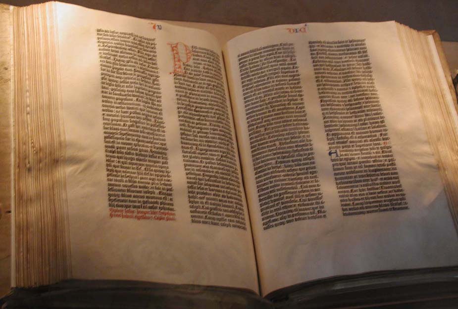
Blackletter is the technical name of the first fonts used in book printing. Early printers like Gutenberg naturally replicated the latest available fonts, which in the 15th century were late medieval forms. See, for example, the Gutenberg Bible at the Library of Congress. Blackletters are the typographic equivalent of Gothic architecture and they correspond to the style's international spread. They were used longer in Germany and are hence associated with German books. Blackletters vary greatly but are divided into four basic categories, textura, fraktur, bastarda and rotunda. They are commonly distinguished by the forms of the lower case "o." Robert Bringhurst describes their differences as follows (and illustrated above):

"Though written with only two penstrokes, the o in textura looks essentiall hexagonal. In a fraktur, it is normally flat on the left side, curved on the right. In a bastarda, it is normally pointed at top and bottom and belled on both sides. In a rotunda, it is essentially oval or round." The Elements of Typographic Style, version 3.1 (2005) p. 266.

Bringhurst gives a few examples of modern blackletter typefaces. Chairvaux was designed by Herbert Maring in 1990, based on the Cistercian abbey of Clairvaux, founded by St. Bernard in 1115. Fette Fraktur is a heavy, Romantic font designed in Frankfurt about 1850. Goody Text was designed by Frederic Goudy and issued by Monotype in 1928.

Uncial is the other prominent type of medieval script. Uncial is a lower case used by scribes from the 4th to the 9th centuries. The script was abandoned during the late medieval period and rediscovered in the 19th century by antiquarians. Due to their pre-Gothic origin, they came to represent a Romantic, early Middle Ages and captured the imagination of the early 20th century.

Tuesday, August 11, 2009

Stone Monuments in Bronze

The late-19th century is wonderful in two tendencies that seem contradictory from our modernist perspective. With the advent of the industrial revolution, new materials emerged in every aspect of life. Molding bronze into traditional stone forms was one such innovation applied in sculpture and sculptural relief. Dyeing the bronze gray completed the illusion. The advantage of new technologies was their ability to out-due traditional materials in decorative detail. If new technologies allowed you to fill even more surfaces with decoration, so much the better for industrialization. The Victorian sensibility also had no scruples in shifting across material without any concern for honesty. Whereas each piece of stone had to be uniquely carved, the molded pseudo-stone could be mass produced.

During a morning walk through Farm Hill Cemetery in Middletown, I discovered something I had never noticed before. What I always thought was a particularly hard form of granite turns out to be cast bronze. Consider the Crook/Grosley family monument (above) , erected in 1884. It looks like a spectacular stone monument. Looking more carefully at its rusticated base, we read the maker's mark MONUMENTAL BRONZE CO. BRIDGEPORT, CT.
Bronze funerary monuments present an interesting problem. Family tombs served for multiple burials. Space was provisioned on the stone surfaces and the carver inscribed the names and circumstances of each new burial sequentially. But this is not possible when your monument is made by an industrial mold. These bronze monuments came up with a good solution. The inscribed panels within the ornate architectural frame are actually bolted onto the monument with screws. If you look closely at the panel of Oscar Crook, Ellen Crook and infant (below), you'll see three bolts disguised in floral design.
The Crook/Grosley monument has two sides naming deceased family members, but the remaining two panels contain visual images, a cross draped with garlands (visible in the first image above) and a classicizing maiden holding an anchor (below).
Although beautifully designed and contributing to the overall narrative of the monument, the visual panels must have also served as place holders. In a wonderful way, they are simply waiting to be replaced by a future family member. The visual message awaits for the text.

Location: 41°32'08.1" N, 72°38'26.1" W
New Farm Hill Cemetery, Middletown, CT 06457

Medieval Fonts: Prior Tomb

In an earlier posting on Wesleyan University's 1868 Memorial Chapel, I mentioned that the font used in the datestone is typical of brownstone funerary monuments of the period. This morning, Popi and I went for a walk at Farm Hill Cemetery, and I got a chance to photograph some of these examples. The tomb of Josiah Prior (1808-1886) and his wife Sally (1897-1856) is of the draped obelisk type. The names of the deceased are carved directly on the obelisk, but the family name at the base of the monument protrudes from a recessed frame. Like the Memorial Chapel font, the carver removed the stone around the letters rather than the letters themselves.
Location: 41°32'07.0" N, 72°38'26.4" W
New Farm Hill Cemetery, Middletown, CT 06457

Monday, August 10, 2009

Medieval Fonts: Judd Hall

Just a few feet south of Memorial Chapel, another building dominates Wesleyan University's campus. The Orange Judd Hal of Natural Science was built in 1870. The font used in its cornerstone shows slight variations from the font used in Memorial Chapel only a year or two earlier. Although Judd Hall's architectural language is completely Renaissance, its datestone carries a different sensibility. The simple bulky Civil War letters of 1868 have become more Victorian with redundant turns and wiggles at the corners. Note the extra concave curves pinching the numbers "8" and "0."
Judd Hall was one of the earliest buildings in the U.S. dedicated to science education. Undergraduate education through the early 19th century centered on Greek and Latin. Scientific education was considered to be a specialization and left for post-graduate studies. Wesleyan took the lead in 1843 by establishing a Bachelor's of Science. The New York Times reported on the buillding's dedication and quoted from the speeches (July 20, 1871). Judd Hall signaled a revolution in higher educaiton "to displace from their leading position in a course of instruction the ancient languages, especially the Greek." I found that highly amusing considering that my wife teaches Greek at Wesleyan's Classics Department.

Location
: 41°33'18.08" N, 72°39'20.80" W
207 High St., Middletown, CT 06457

Medieval Fonts: Memorial Chapel

Memorial Chapel at Wesleyan University's campus was built in 1868 to commemorate Wesleyan students who died in the Civil War. It is an intricate Gothic Revival building with a date stone carved on the northeast corner, reading "MEMORIAL CHAPEL" on the east face and "1868" on the north face. Despite the building's architectural style, the font is not particularly medievalizing. The letters are protruding, round, blocky forms without serifs or ornament.

The stone mason has carved the negative space around each letter, producing a sharp image with deep shadows. Many mid-19th century tombstones and public monuments use this font, which is noticeably different from the recessed Roman fonts in more Classical buildings. Roman fonts would be sharply inscribed, typically on harder stone like marble or white limestone. The blocky letters we find at Memorial Chapel were commonly carved on the soft brown limestone, a prevalent material. The stone was quarried just a mile away at Portland Brownstone Quarries that, during this period, were deeded to the University. These famous quarries on the Connecticut River provided the raw material for the "brownstone" houses in New York City.
Location: 41°33'20.62" N, 72°39'21.43" W
221 High Street, Middletown, CT 06457

Thursday, August 06, 2009

Medieval Fonts: Public Housing

Middletown, Connecticut is full of medieval fonts (see Lettering project). One late specimen (ca. 1969) comes from an apartment block. The sign is about 12 ft. long and 6 ft. tall (6-in grid above). The letters are white and protrude from a brown brick wall to which they are fastened by metal clamps.

Formally, the sign is a brilliant graphic composition with three different fonts. The T of Towers crosses the Stonycrest and roots the design vertically and frames the upper horizontal edge. An ornate S frames the left edge and two floating tildes balance the second line. The medievalizing font of Stonycrest is of a distinct 1960s vintage. It evokes the spirit of a romantic Middle Ages. We find this very font used in the 1960 Broadway production of Camelot starring Richard Burton, Julie Andrews and Robert Goulet.

The LP (above) was the top-selling record for 5 months and, moreover, a personal favorite of President John F. Kennedy (who was college friends with the Broadway's author). "Camelot," in fact, came to designate the Kennedy Administration. A 1967 film version of the play with Richard Harris and Vanessa Redgrave popularized the Broadway play even more widely. In some general sense, America's medieval revival of the 1920s (Tudor houses, academic Gothic, etc.) continued into the 1960s adjacent to the anti-historicist vocabulary of Mid-Modern design.

Now we must turn to Stonycrest Towers, the building itself. Things become even more interesting once we realize that it was no medieval castle but a public housing project, an eight-story concrete derived from the urban visions of Le Corbusier and CIAM.

In the 1960s, the U.S. Department of Housing and Urban Development (HUD) created programs of subsidized housing. HUD provided financial subsidies for private contractors to build public housing. One such company was Carabetta Builders, now the Carabetta Organization. The Carabetta brothers started their career by remodeling kitchens and installing porches in Meriden, Conn. In the late 1960s, they had established a company large enough to receive federal funds for large urban development. By the 1980s, Carabetta Organization was the largest owner of federally subsidized housing in Connecticut managing 1,284 housing units in Middletown alone. Stonycrest Towers was built under Section 221 and 223. Basically, the private developers built affordable housing for lower income residents. After 20 years of subsidized rent, the developer had the option of placing the units into the open market.

Although springing from the Housing Act of 1937, public housing boomed in the 1970s thanks to Section 8 programs. Public housing was invented through a collaboration of local government (impoverished cities), the federal government (HUD), and the private sector (developers). The Carabetta Builders had to create an aesthetic fantasy, a motivation for moving into such radically new domestic forms. The period's idealistic prism sought to create a brave new Camelot, a paternalistic social block evocative of the Middle Ages. Associations with both the Broadway show and the Kennedy Administration were hence deployed. While nothing in the building (except its verticality) relates to Arthurian legend, the text's medieval font creates a quick Pop association.

Below the fantastical name Stonycrest, we also find the name of the contractor prominently displayed on the facade. Inserting "Carabetta Builders, Meriden, Conn." right under the name ensures that both residents and local authorities will remember the building's actual patron--not the federal government in Washington but the local Italian American developer. Given the complex status of the building (half-private/half-public), the sign assures that nobody will forget the structure's rightful ownership. This is especially important given the 20-year clause of the subsidies. The sign guarantee that after 20 years of public connotations, the building would not be forgotten as a Carabetta product. Note, the word "Builder" rather than "Company" or "Developer." If we read the T of Stonycrest as an architect's T-square, we have a graphic representation of building. Like imperial dedications in ancient public works, or founder inscriptions in medieval churches, the inscription takes a proprietary almost legalistic role. It literally underscores the authority responsible for the bricks and mortar in perpetuity.

I don't know enough about Connecticut politics in the 1960s and 1970s to interpret the relationship between the Carabetta company and Middletown's administration. Knowing a little bit about the story of Italian immigration in the area (not typical for New England), I presume that the Carabetta Builders were self-made enterpreneus, products of the American dream. A series of articles in the Hartford Courant, suggest that the relationship between developer was not always great. In 1968, for example, the Middletown Housing Authority turned down the permit for the Carabetta projects due to a 1967 shakedown. On June 27, 1968, the City Planning Commission approved the controversial subdivision. As early as 1977, the Carabetta company was involved in legal battles for raising the rent in 11-owned housing projects. In 1992, they also sought Chapter 11 protection. These are only impressionistic glimpses that I've got from the Hartford Courant. Middletown politics are very complicated. Stonycrest Towers in sociologically interesting. It pithces the Italian self-made, hard-working immigrant community (and its associations) right next to the African-American impoverished population.

The medievalizing public inscription is a beautiful work of mid-modern American design. It needs to be celebrated (and hopefully preserved). It represents the complicated interaction between a federal stimulus package, a national Broadway fantasy and local politics.

Location: 41°34'07.13"N, 72°40'14.82"W
352 Newfield Street, Middletown, CT 06457

Tuesday, August 04, 2009

Lettering

The art of lettering has disappeared thanks to the automated fonts that come with computer software. Graphic designers and font historians have noted the utter ugliness of our contemporary lettering landscape. We are surrounded by signs, quickly produced without any concern for graphic coherence or physical context. The golden age of American inscriptions corresponds to the golden age of American advertising from the 1930s to 1960s. The television series Mad Men makes this amply clear.

I have started to look at building inscriptions more carefully. Middletown, Conn., like most American towns, is a treasure trove of stone carving from the 19th and early 20th century. As I take my 9-month daughter for a walk every morning at 7 am, I stop at buildings around Wesleyan's campus and quickly sketch some letter forms. I can spend a maximum of 10 mins. on each stop before my daughter gets bored and cries out for us to keep on moving. I am concentrating particularly on medieval fonts tracing their style along five buildings from 1867 to 1969. I must confess, I know very little about medieval lettering, as I have little technical expertise on manuscripts, for instance. Nevertheless, I am trying to train my eye on the formal differences of the letter forms and the following blog postings will hence be experimental.

Before showing some of these transcribed letters, I'll mention two books that I'm casually consulting to understand fonts. Robert Bringhurst's The Elements of Typographic Style, Version 3.1 (Point Roberts, Wash, 2005) is a fundamental introduction to the principals of typography. I am also consulting a drafting from 1929, a time when lettering was essential to architectural practice. Thomas E. French was professor of engineering drawing at Ohio State. His book, A Manual of Engineering Drawing for Students and Draftsmen, 4th ed. (New York, 1929) was used as a standard textbook from its first publication in 1911. For those interested, French's 2nd edition (1918) is freely available on Google Books. To understand the spirit of architectural inscriptions, I quote the opening paragraph from the lettering chapter:

"In a broad sense the subject of Lettering is a distinct branch of design. There are two general classes of persons who are interested in its study, first those who have to use letters and words to convey information on drawings; second, those who use lettering in applied design, as art students, artists and craftsmen. The first class is is concerned mainly with legibility and speed, the second with beauty of form and composition. Architects come under both classes, as they have both to letter their working drawings and to design inscriptions and tablets to be executed in stone or bronze." (p. 34)

Tuesday, July 28, 2009

1930s Stucco Swirl

What you see here is not a piece of modern art but, rather, the exterior wall treatment of the house I discussed in 1930s Base Molding. The photo shows what was labeled "plaster" in the section drawing. As already mentioned, Tudor Revival houses did not simply recycle a medieval style but incorporated modern elements. The abstract swirls in stucco are one such element. The jazzy curves are sculptural and vibrant. Ultimately, they are the impromptu creations of an ordinary craftsman, the plasterer who finished both interior and exterior house walls. The sketch below imagines the craftsman's work .
The dimension, direction and physical qualities of the design were determined by the plasterer's body movement as he swirled his trowel (known as a "float") . In the 19th century, plaster decoration involved prescribed patterns and doctrinaire molds. The 1930s swirls, in contrast, required improvisation. The facade itself became a graphic record of the plasterer's dance across a vertical surface. Its qualities are modern in both style and execution because they are quite literally the embodiment of the craftsman's movement.
Formally speaking, such circular shapes were embraced by the avant-garde for their free-wheeling associations. Wassily Kandinsky, Robert Delaunay (above), Arshile Gorky and others had ushered spontaneous swirls into the fundamental palette of modernist art. The post-Cubist abstraction, moreover, trickled down to the visual mainstream through the ornamental treatment of Art Deco. I offer an example below from a 1930s wooden bar cabinet (belonging to my friend Kat in Los Angeles--see Kat's blog here).

The swirling stucco in Tudor Revival houses is the product of an interesting synthesis between building crafts, historicism and the popularization of high-design visual elements. The base molding discussed in the earlier postings is, in some ways, the frame that supports a stucco canvas.

Monday, July 27, 2009

1930s Base Molding: Part 2


In the previous DETAILS, I discussed the form of a 1930s molding and its extinction from the pool of available profiles. Here, I will discuss the molding's function because it illustrates a beautiful solution to a pragmatic challenge. Every building must deal with two critical issues, 1) how to sit on the ground, and 2) how to keep water out. A building's exterior cladding solves the second issue but also addresses the first issue. During the late 19th/early 20th centuries, concrete replaced stone as the foundation material for buildings in the U.S. The house under consideration sits on a concrete base. As mentioned yesterday, one of the favorite cladding surfaces for the Tudor Revival was stucco/plaster. Stucco is a great material because it requires no maintenance, unlike wood cladding (typical for New England) that needs to be repainted every 10 years. Thanks to its preparatory semi-liquid state, stucco also takes on some decorative patterns, typically swirls created on the spot by the plasterer. The stucco is physically attached to the structure through a metal mesh, which is then nailed to the wall's wooden studs. Stucco is slightly porous but ultimately prohibits moisture from penetrating into its thickness (usually 3/4").

When a wooden structure sits directly on a concrete base, a system has to be devised to keep the water from seeping into the horizontal juncture. With wooden cladding, the lowest board overlaps the concrete base. With plaster cladding, however, the plaster cannot be attached onto the concrete. Our 1930s base molding solves the problem. Note in the drawing above that the concrete base was poured with a slight notch, a kind of shelf into which a smaller wooden element is fitted. Above the shelf, sits the large structural base beam. The metal mesh, onto which the stucco is attached, extends 1 1/2" beyond and covers the wood sitting in the concrete shelf. Our nice molding is then nailed into the wood. Looking at the drawing, we understand why our molding is so wide. It serves as a base and a bottom seal for the stucco. Its exaggerated curve, moreover, takes the water away from the juncture and guides it gracefully over the concrete.

Our dramatic fascia molding solves a very specific problem. It is painted the same color as the plaster and gives the illusion of a seamless plastic extension of the wall. At the same time, it provides the facade with two simple lines that define a horizontal base datum. Seen on its own, it's a beautiful shape distilling some stylistic principles of the 1930s. It can stand alone to represent the decade's aesthetics, but it also speaks of a complicated resolution between ground (earth), industry (concrete), structure (wood), beauty (plaster) and sky (rain). That's not bad for a miniature piece of great intelligence.

Blog Archive

Kostis Kourelis

Philadelphia, PA, United States