Saturday, December 31, 2011

The Canonical View

Arthur and Kate Tode (Kahop) made a honeymoon video in 1939 with tremendous value for reconstructing the vernacular streetscape of Athens between World War II. In the previous posting, I discussed their vantage point and visual coverage. The Tode's vantage point towards the urban fabric had become the canonical perspective. Every visitor that climbed the Acropolis in the 1930s was directed to the same observation post from which they visually consumed the modern metropolis. The view was disseminated globally through the personal snap shots that each tourist brought home, as well as, with more official media of mail order periodicals.

The National Geographic Magazine canonized this Athenian vantage point in October 1930 with the photograph above in an article on Vergil's Roman geography, written by Georgetown University's president. Interestingly enough, the caption foreshadows the tension that would emerge between American archaeologists and the modern city when the American School would start digging in the Agora a year later. The caption reads, "After seeing the Temple of Athena Victory, the Propylaea, the Erechtheum with its lovely Caryatid Porch, and the Parthenon, visitors to the Acropolis are conducted to this lookout point above the modern city. In Vergil's day the main city was around to the left, where American archaeologists are soon to tear down scores of homes in order to excavate the ancient market place." W. Coleman Nevils, "The Perennial Geographer," The National Geographic Magazine 58, no. 4 (Oct. 1930), p. 452.

I would like to use the photo above and the Tode film previously to stage a photographic investigation of Athens' architecture in the 1930s. The exercise would, on the one hand, help understand 1930s urban topography, but could also stage a reflexive inquiry on the construction of distant visions. When the photo students visit this very spot in July, we could even stage a rephotographing campaign.

Film Archaeology: 1939 Athens

Thanks to Facebook (Jan Sanders via Stavros Oikonomidis), I stumbled on an intoxicating film of Athens. It was shot by Arthur and Kate Tode (Kahop) on April 25, 1939 during their Mediterranean honeymoon. The original reel resides at the Archives of the University of Pennsylvania Museum of Archaeology and Anthropology (see here). The Tode film is the earliest color panorama of modern Athens that I have seen. It has an uncanny quality with Athenian residents visible in the streets of Plaka. Athens was one of the most beautiful cities of Europe in the 30s and this film can help us reconstruct its historical character. I am envisioning a collective project of film archaeology, where a group of people use online resources and deconstruct each frame. With a combination of freeze-frame sketches and maps, we could produce a powerful visual inventory of Athenian vernacular.


I spent a good hour playing the first 17 secs, over and over again, trying to pick up topographical clues that would reveal the real locations. This is what I have come up with. The camera is set on the northeast corner of the Acropolis next to the flag (lat/long 37°58'18.65"N, 23°43'41.19"W). The axis of the camera is aligned with Epiharmou Street in Plaka and pans over Anaphiotika and Plaka. I reconstruct the vantage with the aid of Google Earth (below). The dome and bell tower visible on the foreground belongs to Agios Nikolaos Rangavas. The line of sight down Epiharmou Street is terminated by an Ottoman period house owned by George Finlay. The street turns West as Scholiou Street. The next parallel street line is Adrianou. As the camera pans out, we see grand buildings along Vasilisis Sofias and Lykavitos rising in the distance. The video represents a 20 degree angle from the Acropolis to Lykaviots and covers the NW sliver of the city. The camera also makes a slight norther turn towards Tourkovounia. Using contemporary plans of Athens, it should be possible to create a database of every building represented. Archaeologists of early modernity could go out into the streets and spot-check the urban fabric. I suspect that the majority of the vernacular architecture seen in the video exist no more. Anyone want to join me in an experiment of video archaeology? If you enjoyed this filmic inquiry, make sure to visit earlier postings on the archaeology of Athenian modernity here, here and here.

Friday, December 30, 2011

Liquid Altar

The Drinker block discussed earlier was discovered at the ancient Asclepeion on the South slopes of the Acropolis in Athens. Excavated by the Greek Archaeological Society in 1877, the few surviving Byzantine walls were removed soon after excavation ("ταύτην μελετώμεν να διαλύσωμεν"). Recognizing the ethics of archaeological documentation, however, the Archaeological Society left a small record of the architecture, hiring M. Mitsakis to produce a site plan ("Η Εταιρία έχει το καθήκον όταν προσεχώς συντελέση την ανασκαφήν, να δημοσιεύση και σχεδιογράφημα του κτίσματος ακριβές."). Above, I have extracted some of the crucial elements to visualize the architectural dialectics of caves and water.

The ancient cave (marked "A") from which water sprang, was converted into a Christian altar. The excavators discovered frescoes along the lining of the cave, but could not make up the subject matter. An upright stone placed on the altar ledge (left) marked the religious character of the cave. The pseudo-Kufic decoration on the upper border helps us date the installation to the Middle-Late Byzantine period. Other sculptural fragments published by Xyngopoulos testify to the occupation of the site. Adjacent to the sacred water cave was an ancient stoa. In the Byzantine period, the ruined foundations of the stoa were used to create a new building (marked in dark lines above) that included a square room ("D") on the east end. Most intriguing in Mitsakis' drawing are the three semi-circular lines signifying the existence of a church with three consecutive phases of alteration.

Completing the water narrative of the site, note the channel ("C") that carried the water from the cave under the church floors into a cistern ("F"). Remembering the drinker graffiti representing the thirst-quenching experience of water, we may extend the vessel cavity into the water cave. The cave-altar becomes a cavity to be inhabited. The water would then exit the cavity through piping (the neck) and be recollected below the body of the church into the cistern.

The sacral metaphors of water are well known in the Byzantine scholarship and found numerous architectural expressions. The waters in the crypt of Saint Demetrius in Thessaloniki or in the crypt of Saint Andrew in Patras are two of the first examples that come to mind. The Byzantine installations on the South Slopes of the Acropolis should be remembered as additional evidence for the spatial articulation of the phenomenology of liquids.

The sketch plan above is based on M. Mitsakis drawing appearing in Praktika (1878). The altar stone is based on a drawing by Josef Strzygowski published by Andreas Xyngopoulos in "Χριστιανικόν Ασκληπείον" Archaiologike Ephemeris (1915), p. 62, fig. 14. It measures 0.95 x 0.34 m.

For those interested in the fine details of the cave, here is the eye-witness report given by Ioannis Phillipos in his Jan. 9, 1877, report: "Ολίγον δε κατωτέρω η πέτρα είναι ορθίως τετμημένη επί μέτρα 25 περίπου προς δυσμάς και υπ'αυτήν κατωτάτω εφανερώθη εν σπήλαιον κωνικού σχήματος τα έσω, με είσοδον κτιστήν, τους τοίχους του δ'εσώθεν έχον επίχριστους και εζωγραφημένους με εικόνας χριστιανικάς, δυσδιαγνώστους διά την εκ του χρόνου φθοράν. Εν αυτώ κατά τον κάτω γύρον αποστάζει εκ της πέτρας και ύδωρ, το οποίον κύκλω περιλαμβάνεται εκ μαρμαρίνω ευρίπω και διοχετεύεται ύστερον έξω διά τας μετ' ολίγον μνημονευθησομένας εκκλησίας μέχρις ου καταπίπτει εις εν φρεατοειδές κτιστόν όρυγμα." Praktika (1877) pp. 17-17.

My rough translation: "A little below, the rock is cut for about 25 meters to the West. Under the rock, we found a cave with a conical interior shape. Its entrance was built with masonry. In the interior, the wall were plastered and were painted with Christian scenes, but it was difficult to discern the subject due to deterioration. Under the lower circle, water drips from the rock. The water is collected by a circular marble feature and is then routed outside of the cave through pipes. The pipes continue under the ancient stoa and under the churches (to be discussed below) depositing the water in a built cistern."

Friday, December 23, 2011

The Drinker

Architectural block (0.84 x 0.38 x 0.07 m), Byzantine, South Slopes, Acropolis, Athens. Kourelis sketch, based on photo (Xyngopoulos, 1924)

Scratched roughly on a piece of masonry, a figure drinks with one hand while fanning with the other. The block was excavated in 1877 at the Sanctuary of Asclepius on the South Slopes of the Acropolis in Athens. It was published in 1924 as a personification of August. The Byzantine remains of the Asclepeion have been forgotten by scholarship. The site contained no less than three consecutive churches, a cave altar dripping with water, frescoes, burials, and lots of sculptural fragments from the Middle and Late Byzantine periods. I will discuss the architecture in the next posting.

The block of the drinking figure is striking in its graphic convention of depicting the interior of the vessel with a sectional diagram. The drawing, thus, communicates what is invisible, the interior container of the liquid as it is depleted through the mouth of the drinker. It helps us clarify the spatial experience of drinking. The neck of the vessel and our mouths are two extended thresholds that transfer water from one invisible interior (the vessel) to another (our belly). The figure raises a vessel to his mouth. He will soon swallow its contents capturing that moment of satisfaction offered by the exchange in a hot summer month. Drawing the vessel in section, thus, clarifies the spatial nature of thirst. It doesn't simply represent what drinking looks like, but it tries to encapsulates the essence of drinking as a spatial experience. The cavity that holds water before it enters the body is terminated by a kind of lip in the interior of the vessel. The hand clasps the diaphragm of the vessel and commands its release. The diagramatic depiction of the vessel may also lead the viewer into other bodily associations of the womb and female genitalia.

The carver scratched a phenomenological experience through a complicated system of graphic abstraction. Liquid transfers through interiorities. If we look at the architectural setting of the Byzantine Asclepeion (in the next posting), we will see that the transfer of water takes over the entire spatial expression of the complex. In other words, this small depiction is a moment in a larger phenomenological experience originating from the origins of water in the dripping cave.

Briefly, I summarize the paper trail from this excavation. The Asclepeion was excavated by the Greek Archaeological Society in 1877. The Byzantine remains were discussed by Philippos Ioannou, in Praktika (1877), 17-20. M. Mitsakis, an architectural intern at the Polytechneion, surveyed the Byzantine walls before they were demolished, publishing his plan in Praktika (1878). A quarter century later, Andreas Xyngopoulos published the Byzantine sculpture from the site, "Χριστιανικόν Ασκληπείον," Archaiologike Ephemeris (1915), pp. 52-71, but did not include the drinker. Andreas Xyngopoulos devoted a separate article on the drinker in the debut issue of the journal of the Society of Byzantine Studies, "Βυζαντινή παράστασις μηνός," Epeteris Etaireias Vyzantinon Spoudon 1 (1924), pp. 180-188. In this essay, Xyngopoulos argues that the image above belongs to a tradition of month personifications, specifically August. Accordingly, the seated August quenches his thirst with wine and cools himself with a fan. In addition to iconographic comparanda, Xyngopoulos quotes a relevant passage from the 15th-century novel Lyvistros and Rodamni.

"Είδα τον Αύγουστον απ'αυτόν, τέτοιον και κείνον φίλε, να ένε από κάυματα έμψυχος εις την όψιν. να στέκεη τάλα εις λουτρόν λουσμένος, κτενισμένος. να ένε εκ τα κάυμα έδιψος. και εις το έναν τον χέριν κούπαν εκράτει με κρασί και έπινεν δια την θέρμην και εις το άλλον του εβάσταζεν χαρτί μετά γραμμάτων και το έγραφεν. φίλε μου, άκουσε να το μάθης τους κάψει η θέρμη του λουτρού, τους φλέξει και διψήσουν, κατάψυχον ας πίνουσι οίνον, μην τ' αθετούσιν."

The novel was translated into English by Gavin G. Bates, Three Modern Greek Romances (New York, 1995). I will get the English translation next time I visit the Penn library.

Tuesday, December 20, 2011

Hart Crane: Legend

Grading exams and papers at the end of the academic semester offers one the unstructured freedom to pepper the mechanical with a few breaks of inspiration. During the last week of classes, Art & Art History students presented their thesis proposals. This is my favorite academic event of the year because it's one of the rare instances where my department sits for an hour and a half and collectively discusses issues of great intellectual substance with the students. It's the closest that we get to a salon culture. Discussion over Virginia Woolf, the Bloomsbury Group, T.S. Eliot and flowers rekindled earlier poetic discussions with Kevin Brady, the greatest fan of Wallace Stevens I have ever met. Kevin's interests had been further inflamed by his current proximity to Stevens' birthplace, Reading, Pa.

The opportunity to procrastinate in the midst of grading, also brings me back to a book that I half-started to read during the semester by another great fan of Wallace Stevens, Harold Bloom. In The Anatomy of Influence: Literature as a Way of Life (2011), Bloom returns to the poetic lineage that he has been studying all of his life, the tradition of the sublime. This Longinian tradition includes Shakespeare, Milton, Shelley, Yeats, Stevens and Crane. Although I have been terribly interested in the theorists of the sublime (Burke, Pater, Freud), I must confess that I have never read Bloom's late poetic tradition. Too enamored by the difficult coldness of Eliot, Pound and Williams, I have missed Stevens and Crane. I had read Brooklyn Bridge years ago, but only for the academic purpose of reconstructing American modernism.

This morning, I brought my pile of blue books to a neighborhood cafe, but made the mistake of sneaking in my bag a brand new copy of, Hart Crane: Complete Poems & Selected Letters (Library of America, 2006). The first poem, "Legend" compelled the drawing above. The blue books had to wait.

Monday, December 19, 2011

Prospecting Coatesville

The drawing on the left is just a quick look at the exterior of Lancaster's Pennsylvania Station showing two courses of marble revetment, the limestone base molding and the system of brickwork. The Pennsylvania Main Line to Lancaster stops at one of PA's most important steel-mill towns, Coatesville. The steel beams of the World Trade Center, for instance, were manufactured here. The quick sketch on the right tries to map the dynamic microcosm of Coatesville that developed at the intersection of the Brandywine River and the Main Line railroad. There is Lukens Steel, the 19th-c grid town with its cottage row houses, and a conspicuous suburbia that developed around Rt. 30. Coatesville contains one of Modern Architecture's forgotten landmarks, Carver Court, a housing project designed by Louis Kahn, Oscar Storonov and George Howe in 1940. The complex seems to be still standing, but I haven't explored it yet. It would be interesting to compare Carver Court with the "Pennsylvania House" that Howe designed with Wharton Esherick the same year for 1939 World's Fair in New York.

Friday, December 16, 2011

J. Harry Hartman

Quick stroll through Lancaster cemetery before the rain broke out. Picked out one funerary monument, vaguely related to the steeple type discussed previously. First, I was tempted to sketch the grave of Frederick Rauch, F&M's first president and co-founder of Mercersburg Theology. This is the only grave I've ever seen to reflect on Hegel. But I held back. Instead, I admired the 1881 tomb of J. Harry Hartman who died at the age of 18. J. Harry's father, Samuel, became well known in the pharmaceutical industry as the creator of PE-RU-NA, a potion that cured catarrh. Dr. Samuel died in 1918 and was buried next to his son, as did J. Harry's mother in 1930. Below the statue and above the inscribed plaque, there is a circle with J. Harry's monogram. It's not the most readable of monograms, but it combines "H" and "J" and "h" in an ingenious way.

Wednesday, December 14, 2011

Steeple Cross Grave Monuments

One of my favorite grave monument types incorporates a plinth, a plain cross, compressed columns at the corners and a massive steeple. So far, I have found three examples of this monument and it's likely that they were produced by the same company: Harrington Monument (left) in Woodland Cemetery, Hand Monument (right) in Laurel Hill Cemetery, and another example at Old Cathedral Cemetery on 48th and Lancaster Ave., Philadelphia. I am assuming some Frank Furness influence.

Tuesday, December 13, 2011

Eliot's Houses


Clearly not in the spirit of the Holidays, but T. S. Eliot's "Four Quartets" helps me wrap up my "House-Home-Hood" capstone seminar.

Monday, December 12, 2011

Romanesque & Gothic


Last two study sheets for my History of Architecture class

Thursday, December 08, 2011

Nuts and Bolts (Lancaster Object 007)

SPS 10, found in Lancaster parking lot @ 40°03'7.39"N, 76°18'42.72"W
SF07 Penn USA, found in Philadelphia street @ 39°57'11.07"N, 75°11'41.65"W

Thursday, November 17, 2011

F&M Tattoos

This is part of an independent study I'm supervising, an ethnography of my college's tattoos. A bunch of our students have set up a photo booth on campus where everyone can walk in and show their tattoo. Each tattoo is shot and measured by students in our photography classes. A recorded interview follows. The photo booth was up for two days at the New College House. The sum total of data was 65 tattoos and 40 interviews. Looking forward to the analysis.

Saturday, November 12, 2011

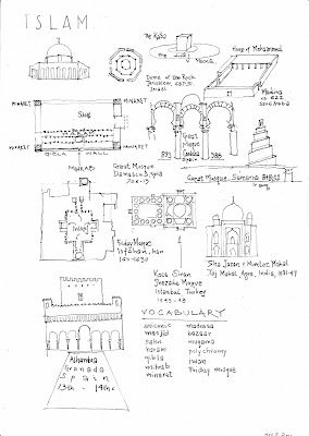
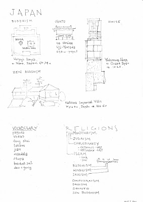
Architecture of World Religions

The first third of my History of World Architecture focused on antiquity (prehistoric to late Roman). During the second third of the class, we turn our attention to the architecture of the major global religions from monotheism (Judaism, Christianity, Islam) to the religions of India (Buddhism, Hinduism, Janism), the philosophical traditions of China (Confucianism, Daoism) and Japan (Shinto, Zen). My students are now studying for their second exam and I have prepared the following graphic lists to organize their studying. The last third of the class will be devoted to the western Middle Ages (Carolingian, Romanesque, Gothic). Stay tuned.


Thursday, November 10, 2011

Andritsaina Boys 1903

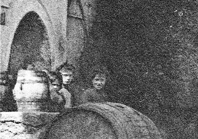
With the 1936 original second edition in hand, we can zoom into the middle left side of Fred. Boissonnas' "Great Plain Tree" of 1903 and catch a slice of daily life in Andritsaina (see last post). Many of the mountainous villages of the Peloponnese are strategically located on springs. Spring houses create urban centers, define neighborhoods (mahala) and social life. Greek folklorists have studied the role that spring houses played as liminal spaces for feminine agency. Women, who were typically assigned the task of water collection would congregate at the spring. As a "third space," neither fully private (domestic) nor fully public, the spring house was the site of illicit behavior, courting, experimentation and feminine solidarity.

Water-needy plain trees would grow next to the spring house and provide a focal point for gathering, shade, etc. The "platanos" at the center of the village would typically be one of the oldest trees in the village and would accumulate an iconography of primitive origins, a wet cool shade and a rootedness with place. The village spring would become both a social and a metaphysical center. In the ethographic literature of the late 19th and early 20th-century, the village square began to stand for the coherence of Greek agrarian community. Andritsaina's spring house is particularly important. It's one of the oldest spring houses in the Peloponnese dated by an inscription. A plaque inside the spring's blind arcade commemorates the year "17X9" and declares that it was constructed by the community.

Boissonnas' photo reveals an uncanny moment within this historical monument. Three children stare back to us in the darkness of the plain tree's shade. Remembering Roland Barthes "punctum," we realize that those children are already dead; they have literally receded into the darkness of forgetfulness. They are hard to see (see below), but enough is there to let us reconstruct their posture (see sketch above).

The boys are nestled behind a circular barrel. The left edge is framed by a vertical jar connected with the left boy who hangs his hands from its upper edge. The jar is well framed by the circular outline of the spring's stone arch. The second boy from the left is pensive and inactive. He looks at us from a position of depth and introspection. Half of his body is concealed by the active boy as the two melt into one figure. The right pier of the arch lands on the figures resting all its massive weight on the boys' shoulders. At the far right, tragedy is coupled with comedy. A third boy, not formally connected with the right pair smiles at us. The smiling boy is free from the architectural embrace of the arch. He stands outside of the arch. The placement of his hands and shoulder give the impression that he might push the horizontal big barrel and make it roll. The static radius of the arch along the picture plain can be coupled by an active radius of the unstable barrel ready to rolled. The formal elements that make the boys so beautifully arranged are, of course, accidental. Boissonnas may have staged many of his photos (especially his interior domestic shots), but this seems to be a pure urban scene. By happenstance, the three boys are caught in a three dimensional space of rotating circles. It's a wonderful composition that stands apart from the strictly objective data that this photo provides. The detail gives us information about technologies of water transport, craftsmanship, clothing (discernible caps), and social bonds. But beyond their archaeological utility, Boissonnas photo encapsulates a tightly coherent visual moment.

Saturday, November 05, 2011

Andritsaina Plateia 1903

Fred Boissonnas published a number of photos from the central square (plateia) of Andritsaina from his 1903 trip. The first (discussed in the previous post) was taken a few feet down the sloped street. The second, on the left, Bossionnas published in the 1909 travelogue with Daniel Baud-Bovy. I have got a hold of the second 1936 edition of the volume, En Grèce: Par monts et par vaux (Geneva), owned by Lock Haven University in central Pennsylvania. The book is a beautiful folio (3x2ft) and the central square of Andritsaina is included in p. 85. Le grand platane (printed as 12.7 x 6.8cm) shows the main village square with its old plain tree growing next to the central spring house. Most of the same 9 buildings as the previous photo are included. The general atmosphere, however, is much different. Rather than capturing an elder walking down the street, this image is centered around the self-conscious watching of the camera by the elder perched on his stick at the right center, three teenagers hiding in the shade of the spring house, and a crowd of villagers lounging at the kaffeneion in the distance. The human subjects are more distant in the camera's depth and are less engaging. What carries the image, instead, is a reliance in the formal composition of light and dark and strong diagonals. In combination with the other images, more architectural information is revealed, such as the paving of the sidewalk the construction details of the wooden balconies and the double arches of the spring house. Some thoughts on composition follow.
Thursday, November 03, 2011

Andritsaina 1903

My photography colleague John Homgren and I have been designing a summer program in Greece for July 2012. Our "Greek Vernacular" seminar will tackle the medieval and early modern architectural topography within The Parrhasian Heritage Park, one of the most interesting cultural management projects in Greece. The seminar will have half studio artists and half archaeologists, as we tackle the interface between subjective and objective methodologies in historical archaeology. We have chosen this territory because it overlaps with the extensive documentation that I have done with the Morea Project during the 1990s. One of our goals is to investigate the Morea Project's photographic collection as an archive in its own right. Between 1990 and 2000, the Morea Project took thousands of photographs of vernacular houses. If you remember, the region of Eleia was ravaged by fires in 2007. I had mapped the overlap between the fires and the Morea Project's coverage in a 2008 posting here. The destruction of this architectural material by fire, development and neglect has made our Morea Project photographs all that more significant.

But in addition to revisiting our own photographs, Holmgren and his students will tackle a larger question, namely the photographic tradition that developed in the region since the late 19th century. Holmgren is inspired by Mark Klett, the founder of the Rephotography movement. Coincidentally, Toshi Ueshina was one of Klett's collaborators in Third View and my photography colleague in the Art Department at Clemson University. It will be a great honor to have Mark Klett visit F&M as our annual Nelson Speaker.

Thinking about the objective/subjective intersections of archaeology/photography, I began a historical survey of early photographs covering the Morea Project area. To investigate the documentary utility of this material, I began looking carefully at one of the best known photographic journeys in Arcadia by Fred Boissonnas's in 1903 (pictured above). A set of five photographs depicts the village of Andritsaina that the Morea Project surveyed in 1996 and published in Houses of the Morea (Athens, 2006), pp. 162-63. Some of the Morea Project negatives from 1996 have been scanned and made available online here (search for Andritsaina). As an experiment, I began looking at Boissonnas's photo of Andritsaina's Main Street (one of two shots) as a document of architectural information. With a quick sketch of the photo (below), I began to identify some of the salient architectural features. Relying on low resolution scans of the image (and not the original plates or prints), limited the resolution, nevertheless, a number of features worth documenting sprang immediately from the image. The exercise here was to leave aside the aesthetic deconstruction of the image as a text, and take it at face value. This would follow the objective goals of our seminar and would include identifying the precise location of the photograph in Andritsaina and documenting any surviving architectural facts. Before the site reconnaissance, the image can be tapped for specific information about 18th and 19th-century architecture. A process of decoding the photo would involve extrapolating from the perspectival view a reconstructed set of construction details or general elevations. Notice for instance the scrolling iron bracket that supports the balcony in the right foreground. I have extrapolated it as an elevation (right below). Such a sketch could then be used in the field, seeking to identify this or other examples of historical ironwork in the village. The photograph gives a good terminus-ante-quem. The two buildings facades on the right foreground have been extrapolated as elevation drawings, where we can clearly see relative chronologies, such as a white-washed facade (versus the side wall), a relieving arch above the wooden lintel. This exercise can be further refined as an investigative tool to be taken into the village or matched with the Morea Project photos from 1996. The following drawings were done as a test on my train ride home last night. The possibilities seem endless and I look forward to my collaboration with John.

Tuesday, November 01, 2011

Monday, October 31, 2011

Sunday, October 30, 2011

Saturday, October 29, 2011

Friday, October 28, 2011

Sometimes

Sometimes, my candle scarcely out, my eyes would close so quickly that I did not have time to say to myself: "I"m falling asleep." Swann's Way

Monday, October 17, 2011

House & Garden 1914

Riding the Mainline, reading House and Garden, January 1914. Transcribing interesting company fonts for Brunswick Refrigerating Co. and the Kelsey Warm Air Generator. Must return to Mott's plumbing, the inspiration for Duchamp's R. Mutt persona in Fountain (1917).

Roman Architecture

Here's all you need to know about Roman architecture (to pass my class)

Thursday, October 13, 2011

Henry Darger

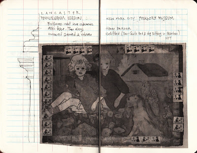
Henry Darger is my new favorite artist. Sadly, I learned about him while learning about the failures of the Folk Art Museum in New York, where most of his works have been donated. These are tough times for anything vernacular. The Folk Art Museum is an of the Bilbao Effect, gone array. The new building by Billy Tsien and Tod Williams has contributed to the institution's demise. My sketchbook re-appropriation of Darger's appropriation includes elevations of the iron columns from Metal Vitruvius.

Tuesday, October 11, 2011

Lechaion Basilica Graffiti

William Caraher has posted his working draft of "The Ambivalent Landscape of Christian Corinth: The Archaeology of Place, Theology, and Politics in a Late Antique City," a fascinating paper that seeks to pull together direct and circumstantial evidence about a power struggle between local and imperial identity in mid-6th-century Corinth. The paper combines new survey data on rural villas (potentially domus-ecclesiae) with the better-known excavated mega-churches, such as the basilica at Mount Lechaion.

In one section of the paper, Caraher seeks the voices of local craftsmen employed by the imperial building boom left behind on the fabric of the building (p. 17). He cites Sanders wonderful discovery of fish graffiti in the mortar bedding of the Panayia Bath, Lechaion basilica and other monuments in Corinth. To this list, I would like to add a couple of additional evidence, based on some notes and slides that I took in a 2000 visit.

1. "Save Me"Few of the marble blocks of the Lechaion basilica contain evidence for a numbering system related to the process of production, transportation and erection. One such block, an Ionic column base dividing the nave and the aisles contains number 1 (Greek letter "A"). The block, however, also contains an inscription of Christian content Σώσων, referring to salvation. Like the numeric Alpha, this inscription would have been disguised by the next column drum. It offers a fascinating example of the mason's temporarily visible/permanently immured apotropaic prayer. Unfortunately, I didn't transcribe or trace the inscription in detail. This slide from 2000 is all I have, but enough of it is visible. The photo also illustrates the evidence for attached parapets that would have divided nave from aisles.

2. Kappa for Korinthos?

In addition to the fish scratching on the plaster, I also noticed the pattern above, vertical lines flanked by two angled lines that make up two Kappas, one Chi, or even some vestige of Chi Rho. I have the vague memory that this slide was taken from the exterior surface of the apse (but it's 11 years ago). As in the case of the fish, these lines were scratched on the plaster to create an adhesive surface for the decorated layer. They were never intended to be seen. Yet, one cannot help but speculate whether these scratches have any linguistic significance. The Long Building that Sanders excavated in the Panayia Field also had such lines (if I remember correctly). In the Middle-Byzantine period the letter "K" or "X" was used for intentional decorative purposes in exterior walls. In Corinth, one can see it at the lower courses of the Tower Building that still survives in the Forum area. The letter "K" is rather common for such Middle and Late-Byzantine walls throughout Greece. Its appearance in the exterior of churches in Kastoria has been used as evidence for urban insignia. The examples from Corinth warrant further thought. Was this just a standard way to prepare a wall surface? or did it have special significance? I let Bill Caraher sort this one out.

Thursday, October 06, 2011

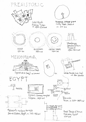
Monument List

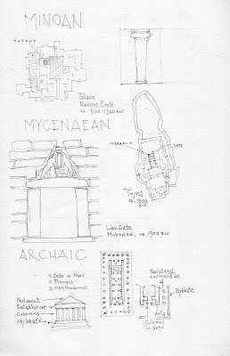
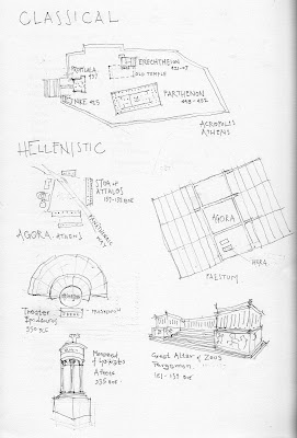
The latest manifestation of my History of Architecture class includes a global perspective and lots of drawing exercises that include measuring columns, constructing orthographic documents, crafty tools that diminish the distance between the sacred canon illustrated in our textbook and the profane vernacular that surrounds us. The first exam is slowly approaching before Fall Break and covers Neolithic, Mesopotamian, Egyptian, Aegean, Greek and Roman architecture. Rather that handing out my usual list of monuments to memorize, I've decided to step up my game. Since I'm making students communicate through drawings, I've decided to create a graphic handout. My goal is to convince them that drawings have less to do with skill or beauty but with communication. By seeing my drawings, they realize that although a little better than theirs, they are not masterpieces. What separates their drawings from mine is a bit of practice.

The hand-drawn sheet contains a richness of information that a Word-Processed list cannot replicate. More importantly, the hand-drawn sheet immobilizes the students from their natural habits of manipulating digital information (cutting-and-pasting, googling instead of reading, etc.) The monuments are selected from our textbook, Moffett and Woodehouse, Buildings Across Time: An Introduction to World Architecture. I do these sketches quickly on the train and they highlight issues that I have covered in lecture. For instance, we spent some time in class unpacking imbedded proportions in the classical buildings on campus. The students tested Vitruvius by measuring their own bodies, their bodies in a Doric colonnade and the bodies in relation to the parts of an Ionic base. When they meet Robert Stern in person next week, they'll have a different apprciation of his architecture by having actually measured the proportions of Stern's Ionic base.

The handout is drawn in pencil and then Xeroxed. Unlike these scanned images, the Xerox copies are crips and punchy. I enjoy the qualitative difference between the analog and digital versions. When I assign drawing exercises, I handout special paper. Most of them approach the thicker stock with greater reverence. The change in weight, texture and quality destabilizes the notion that a print-out is a portable version of a computer generated file (that costs 10 cents). Students know that something is special when crafted by hand. I've been amazed by how much my students appreciate (even fetishize) drawings and the process of generation.

Tuesday, October 04, 2011

Pointy Students

I get depressed as I write letters of recommendation for students applying to Rhodes and Marshall Scholarships. In trying to sell an extraordinary package, I realize my academic contribution to the economic polarization of American society. James Atlas spelled it out succinctly in his Sunday New York Times opinion piece called “Super People.” Indeed, the academic arena is devoted to the cultivation of a new class of individuals that are groomed from young age to achieve in all the registers that spell out success. Since collegiate success is the surest indicator for economic mobility, whatever humanistic endeavor we accomplish in the classroom translates into hyped market value. Our academic goals have long transitioned from the Enlightenment notion of Bildung to the instrumental notion of Academic Excellence. The former was intended to construct a full human being with the very critical faculties necessary for citizenship in the nation-state. The latter is intended to teach students how to excel above the socio-economic mean, how to accumulate and replicate power. Whether measured by SAT scores or peer-reviewed publications, academic excellence cannot be dissociated from what actually is going on in American society and its reflection in college admissions. Quantifiable relative value works in the marketplace and, for that very reason, we use it in our classrooms.

Civic service and other explorations into the human condition (the subject of the humanities, after all) become creators of surplus value in a pool of already perfect people. Extraordinary experiences are strategically acquired by the Super People to boost their perceived value. So how will a Super Person stand out in their college or graduate school application? They need to have a spike in their profile, choreographed by an extraordinary value-free "humanistic" experience like building refugee centers in Bosnia or volunteering at day care centers in Guatemala. Admissions officers have a special word for these people, they are “pointy.”

Like most liberal arts colleges, Franklin & Marshall specializes in the cultivation of “pointy” individuals who will excel in post-graduate arenas. We, the educators, have been very disingenuous in maintaining the Bildung myth, while inflating the market with seemingly value-free collegiate experiences. We all aspire to cultivate full individuals with humanistic depth and breadth. But we should all realize that our actual role in the dynamics of American society is the fabrication of spiky profiles, a strangely subverted ideal. There is nothing that I love more than creating Pointy students, but it depresses me to think that Pointiness is the single most operative capitalist value in the marketplace of the liberal arts college.

Monday, October 03, 2011

Reporting from Athens: The Ohio Tradition

When William Caraher was Carpenter professor at the American School of Classical Studies at Athens in 2007, he started an interesting experiment: blogging his experiences of Greece for a digital audience. His New (and Old) Archaeology of the Mediterranean World has been one of the most enduring and popular blogs, which Caraher continues to write from North Dakota, Cyrpus or Australia. Caraher's reporting from Athens was captivating for readers who had been through the ASCSA program and were hungry to read accounts of daily life. The experiment of reporting from abroad did not die with Caraher's return to the U.S. Katie Rask picked up the torch as a fellow at the ASCSA with Antiquated Vagaries. Among a myriad of other things, Rask conducted urban topographies of 20th-century Athenian avant-gardes, a unique oral history project and the first documentary record of archaeologist tombstones.

Beginning as foreign correspondents, both Caraher and Rask created a coherent genre that became addictive. It is with great pleasure that I learned today that blogging from the American School continues with Dallas de Forrest's Mediterranean Palimpsest launched on Sept. 18. What is fascinating about the Caraher, Rask, de Forrest trilogy is one common thread, namely Ohio State University. Superficially, this link reveals an organic circle of friendships and the need for human encouragement for blogging that defies the inherent digital distance. But I think there is something more important to the Ohio connection. Those following the current debates over Modern Greek Studies in the U.S. are aware of the concept of Ohiology, put forth in the May 1998 issue of the Journal of Modern Greek Studies. Ohiology refers to a highly theoretical strand of the discipline that received criticism by older generations of scholars. Although they may not agree with my assertion, Ohio State contains a powerhouse of theoretical Hellenism: Gregory Jusdanis, Georgios Anagnostou, Anthony Kardellis, Tim Gregory. To use a Greek colloquium, δεν παίζονται. Caraher, Rask and de Forrest are archaeologists with no stakes in Modern Greek areas studies. Yet, their sensitivity to post-classical Greece is so incredibly acute that the imprint of Ohio cannot be coincidental. It is with great pleasure that I read Mediterranean Palimpsest as the third manifestation of a blogging genre. I have no doubt that future historians will assess the postings from Greece as primary documents of a new digital relationship with a physically present Greece.

Saturday, October 01, 2011

Card players

Cezanne's Card Players series from the early 1890s is currently on view in a mini blockbuster at the Metropolitan Museum. The series is based on Cezanne's studies of peasant life in Provencal. The Austrian painter Georg von Peschke must have seen the series in Paris during the 1920s before moving to Greece. He carried out his own version of card players in Skyros. As I prepare the first Peschke exhibition in the U.S., I think of artistic lineage. Interestingly enough, Peschke's Skyros' Card Players best resembles Cezanne's Card Players in the Barnes Collection. Peschke's Card Players was exhibited in Athens during the 1930s and was bought. My sketch on the left is based on a woodcut that is based on the original. I must now follow the paper-trail and figure out where and when Peschke saw the Card Players that ended up in Barnes' collection in Lower Merion, Pa. Strangely enough, the Peschke is coming closer than ever to its model.

Thursday, September 29, 2011

DIY Attic Base

Everybody should be able to construct their own Attic base. It's a beautiful and simple process. In my history of architecture class, I've sent my student scourging through campus measuring column bases. F&M's Georgian pretensions have guaranteed an endless supply of classical details. And I'm sure there is no shortage of Attic bases in your own hometown. Go measure it, or make one yourself. Just follow Vitruvius (III.5) or Alberti (VII).

1. Take the diameter of your column and divide it in 2 (ie. the column radius). This is how tall your base should be.
2. Divide that into 3. The lower third should determine the height of your plinth.
3. Take what is left above and divide it by 4. The top quarter will give you the height of your upper torus.
4. Take what is left between your base and upper torus and divide it into two. That will give you the height of your lower torus.
5. Divide what is left over between upper and lower torus into 7. The top and bottom sevenths will give you the height of your two fillets.
6. Whatever is left over will be your scotia.

The proportions are quite simple and easy to construct. In 2003, Mario Carpo wrote a fascinating essay in the Journal of the Society of Architectural Historians, "Drawing in Numbers," where he traced the translation of the proportional values into a numerical system with the emergence of modernity and calculus. My sketch above is based on Carpo's analysis. I look forward to reading Carpo's newest book The Alphabet and the Algorithm (2011) that deals with the issue of digital duplication.

Wednesday, September 28, 2011

30th Seat

For about the last month time seems to have changed duration. An earthquake shakes Philadelphia followed by a hurricane. A tropical storm by the name of Lee floods Pennsylvania. Trains stop and roads are shut making passage to Lancaster a daily adventure, while I'm the last person to drive Alexis' Mini Cooper before it's destroyed by water. Misty's husband suffers a sudden aneurism and passes away leaving a huge hole in the hearts of the entire F&M community. Celina's parents move to Philadelphia from Albuquerque and we suddenly have family in town. Fred Cooper passes away, his heart giving up, exhausted by chemotherapy.

So time comes to sit. And I sit on the beautifully paneled seats of Thirtieth Street Station in Philadelphia. And I measure away trying to understand what makes this moment so infinitesimally precise.

Monday, September 26, 2011

Metal Vitruvius

Fred Cooper passed away yesterday. One of the giants of ancient Greek architectural history and archaeology, Cooper left an indelible mark in all of his students. But he hated memorials. In his honor, I will spend a few blogging moments thinking about the hidden beauty of the architectural world that Fred taught me to see.
Vitruvius left instructions in how to construct the Attic base. It has been much imitated in neoclassical buildings throughout the world, including the Georgian and Georgian Revival traditions of Lancaster, Pennsylvania. The architects of the 1929 Pennsylvania Station at Lancaster were fully conversant in that tradition, following the Vitruvian instructions, re-interpreted in Alberti. Two columns and four flanking pilasters revive classical proportions in the sinuous contours of the upper taurus, scotia, lower torus and base. The components are carved in white limestone. Looking out of the second story window and glimpsing at those large column bases, one cannot but be moved by the plastic nature of the stone and the impeccable relationships of concave and convex form as they sculpt out positive and negative space, while also encouraging a natural trickle of water.

In contrast to the decorative columns of the front façade (whose work is really done by immured steel beams), the columns that support the train platforms are made out of steel. The Ionic vocabulary here is not carved out by a master-mason, but industrially poured into formwork and mass-produced. The seemingly never-ending renovation of the station has revealed the inner-workings of the Ionic columns in steel.
 
Many of the bases are under repair and the passerby can observe the inner workings of the original construction. For every column, we have two semi-circular base-halves that were brought together. The two halves would then be screwed into two inner metal plates at the column’s base. The screws are visible in the exterior of the columns. The cylindrical shaft would then be inserted into the base ring. One discarded column base is covered with concrete in the interior, suggesting that concrete was poured between the outer ring and the cylindrical shaft. Once painted white, the metal columns would visually unite the station’s overall classical language. But unlike the proper limestone columns on the exterior, the steel columns were manufactured by a different architectonic process. As early as the mid-19th century, architects like Henri Labrouste and Viollet-le-Duc asked the question of whether metal ornament should have the same form as stone ornament. They answered negatively giving birth to the inventive forms of Victor Horta, Otto Wagner or Van de Velde.The Beaux Arts academicians of the 1920s felt that the classical orders transcended material determination. They existed within a formal autonomy. Lancaster station’s inventiveness was to translate an old form into a new material and so as seamlessly as possible.


Blog Archive

Kostis Kourelis

Philadelphia, PA, United States