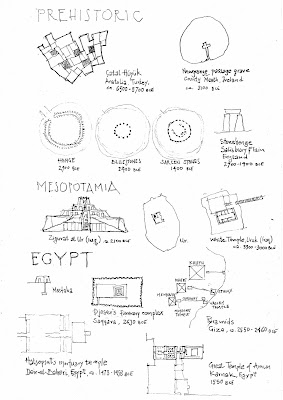
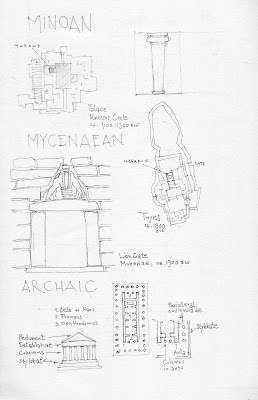
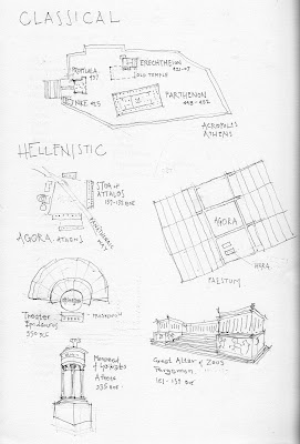
The hand-drawn sheet contains a richness of information that a Word-Processed list cannot replicate. More importantly, the hand-drawn sheet immobilizes the students from their natural habits of manipulating digital information (cutting-and-pasting, googling instead of reading, etc.) The monuments are selected from our textbook, Moffett and Woodehouse, Buildings Across Time: An Introduction to World Architecture. I do these sketches quickly on the train and they highlight issues that I have covered in lecture. For instance, we spent some time in class unpacking imbedded proportions in the classical buildings on campus. The students tested Vitruvius by measuring their own bodies, their bodies in a Doric colonnade and the bodies in relation to the parts of an Ionic base. When they meet Robert Stern in person next week, they'll have a different apprciation of his architecture by having actually measured the proportions of Stern's Ionic base.


 The handout is drawn in pencil and then Xeroxed. Unlike these scanned images, the Xerox copies are crips and punchy. I enjoy the qualitative difference between the analog and digital versions. When I assign drawing exercises, I handout special paper. Most of them approach the thicker stock with greater reverence. The change in weight, texture and quality destabilizes the notion that a print-out is a portable version of a computer generated file (that costs 10 cents). Students know that something is special when crafted by hand. I've been amazed by how much my students appreciate (even fetishize) drawings and the process of generation.
No comments:
Post a Comment